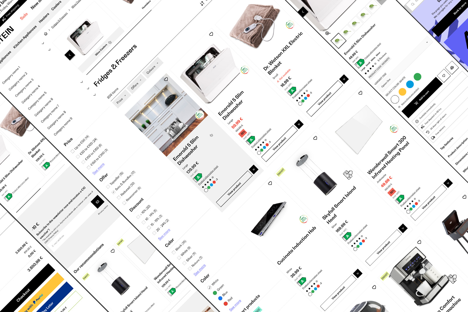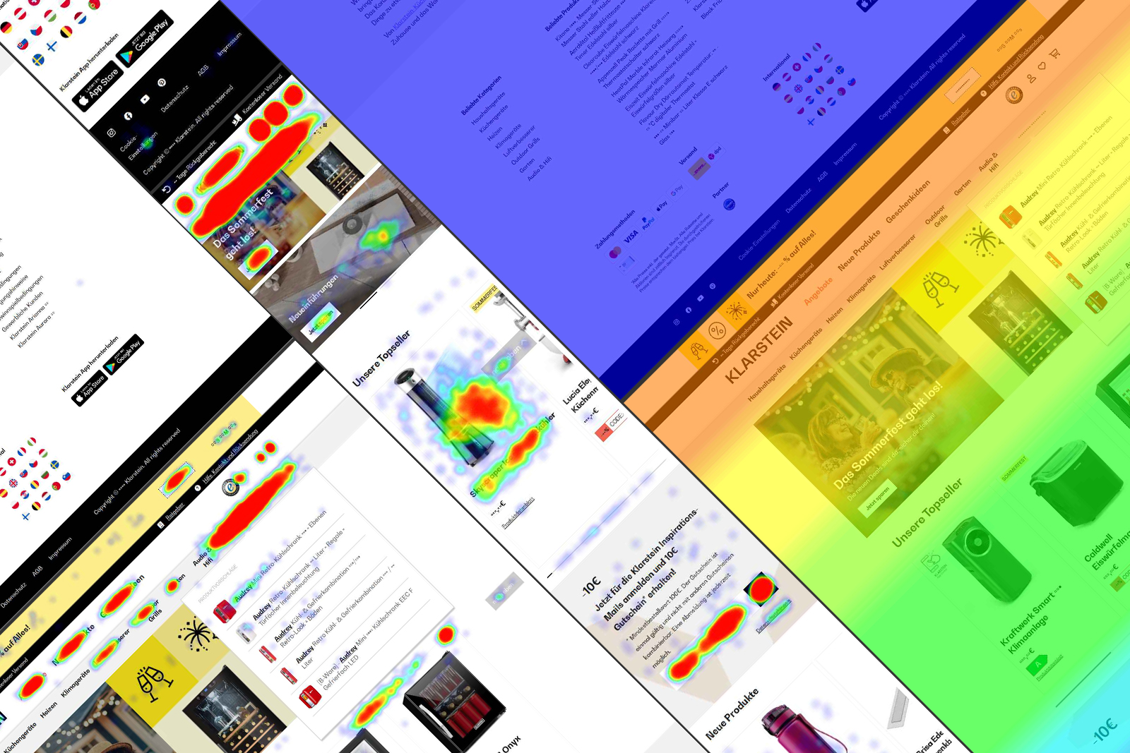
BBG Global Design System
Since 2023, GDS powers Berlin Brands Group with a scalable, cohesive design for all webshopsView case study
I started to redesign every single UI element and, afterward the components, page after page. When the user navigates through the website, he or she must feel professionality and simplicity. This is a project still under development.
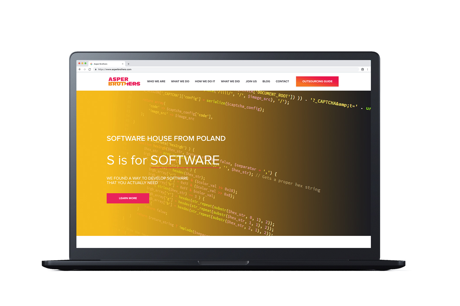
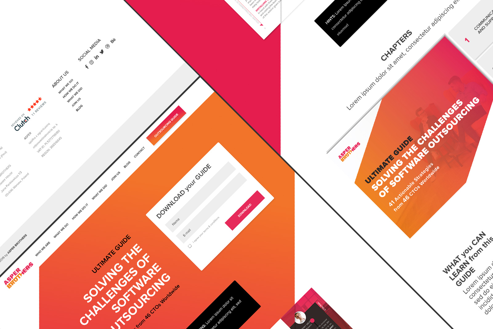
Asper is specialized in Web Apps and the main goal is to attract new CTOs and young entrepreneurs with cool concepts.
I examined competitor websites, Behance projects, and Dribbble concepts. I managed the old contents and rearranged them inside the new visual.
The started point was from the brand manual, where the primary colors were magenta and orange colors. Two powerful colors and I mixed them with white shapes. I followed the guidelines, kept flat shapes, and showed the innovative part of the company. The drawing of components was somewhat square and minimalist.
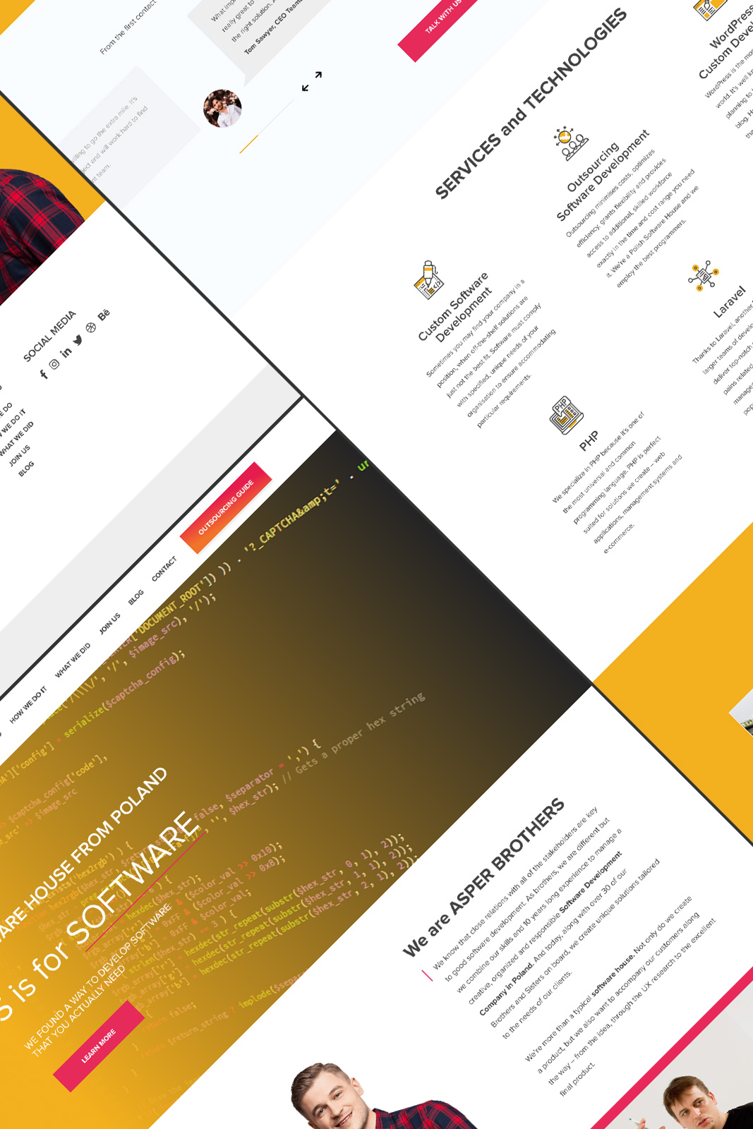
I worked in an Agile team, sharing thoughts with the marketing team, integrating with the social media manager, and communicating with Devs their tasks.
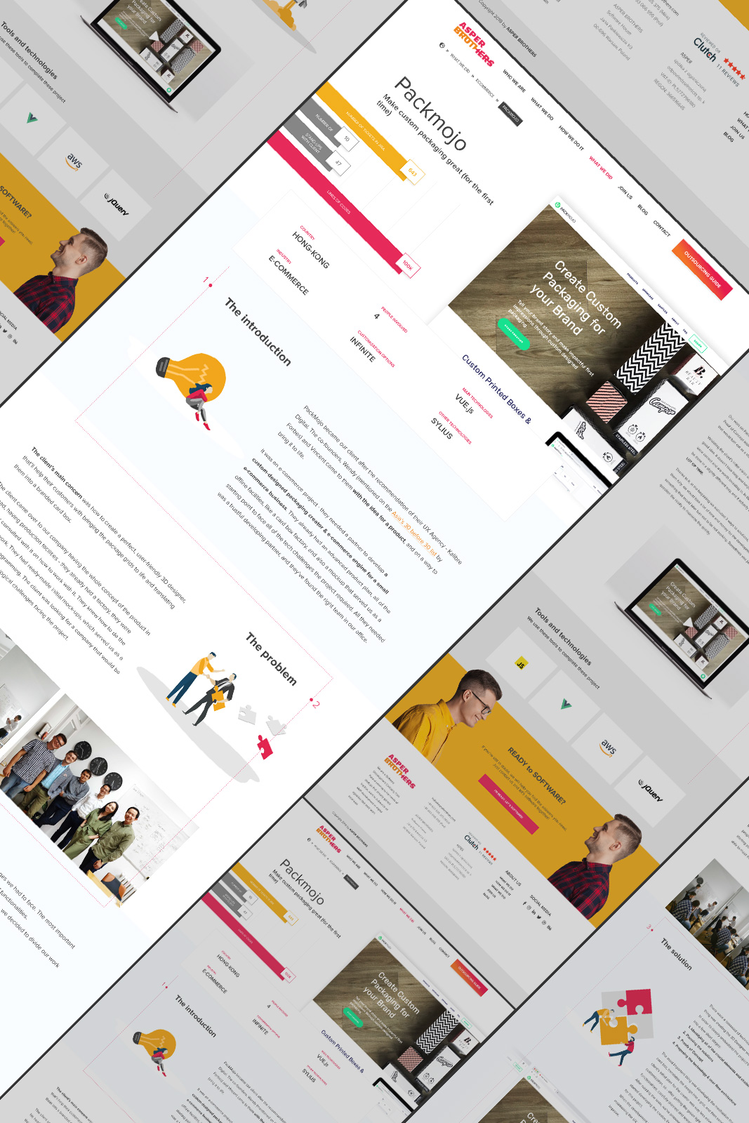
I designed the case study pages following a special path.
I designed the top of the page with a large screenshot of the project, followed by an animated column chart of selective data.
A special area below the hero shows the main features of the projects.
The case study is divided by steps, following the evolution of the product, its progress up and down.
