BBG UX Analysis
Since 2024, the UX analysis of BBG webshops has enhanced usability, streamlined navigation, and improved accessibility, creating a more seamless shopping experience.View case study

When I joined Berlin Brands Group in Berlin, I helped spearhead a strategic initiative called the Global Design System (GDS). More than just a rebranding exercise, the GDS aimed to unify multiple webshops under a single, scalable design foundation while preserving each brand’s unique identity. By centralizing essential assets, we planned to increase efficiency, ensure consistency, and enable faster scaling for future brands.
Berlin Brands Group, Berlin (DE)
Figma, Jira, Asana, GitHub, SCSS, JSON, Confluence
UI/UX Designer
Product Owner
Despite having multiple webshops—Klarstein, Blumfeldt, Electronic Star, among others—each site followed its own design principles. This led to:
Reduce cart abandonment from 60% to 30%.
Provide a standardized design system that cuts dev time for new brands by 30%.
Improve brand consistency with shared color palettes, typography, and UI components.
If we reduce the checkout process from 5 steps to 1, cart abandonment will drop by 20% or more.
If we adopt a single source of truth (e.g., shared components and tokens), we can lower dev overhead by 20–30% across all shops.
Aligning visual elements (colors, typography) will boost brand recognition and user trust, reflected in improved returning-user rates.
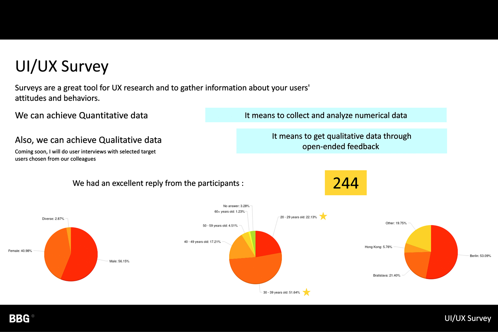
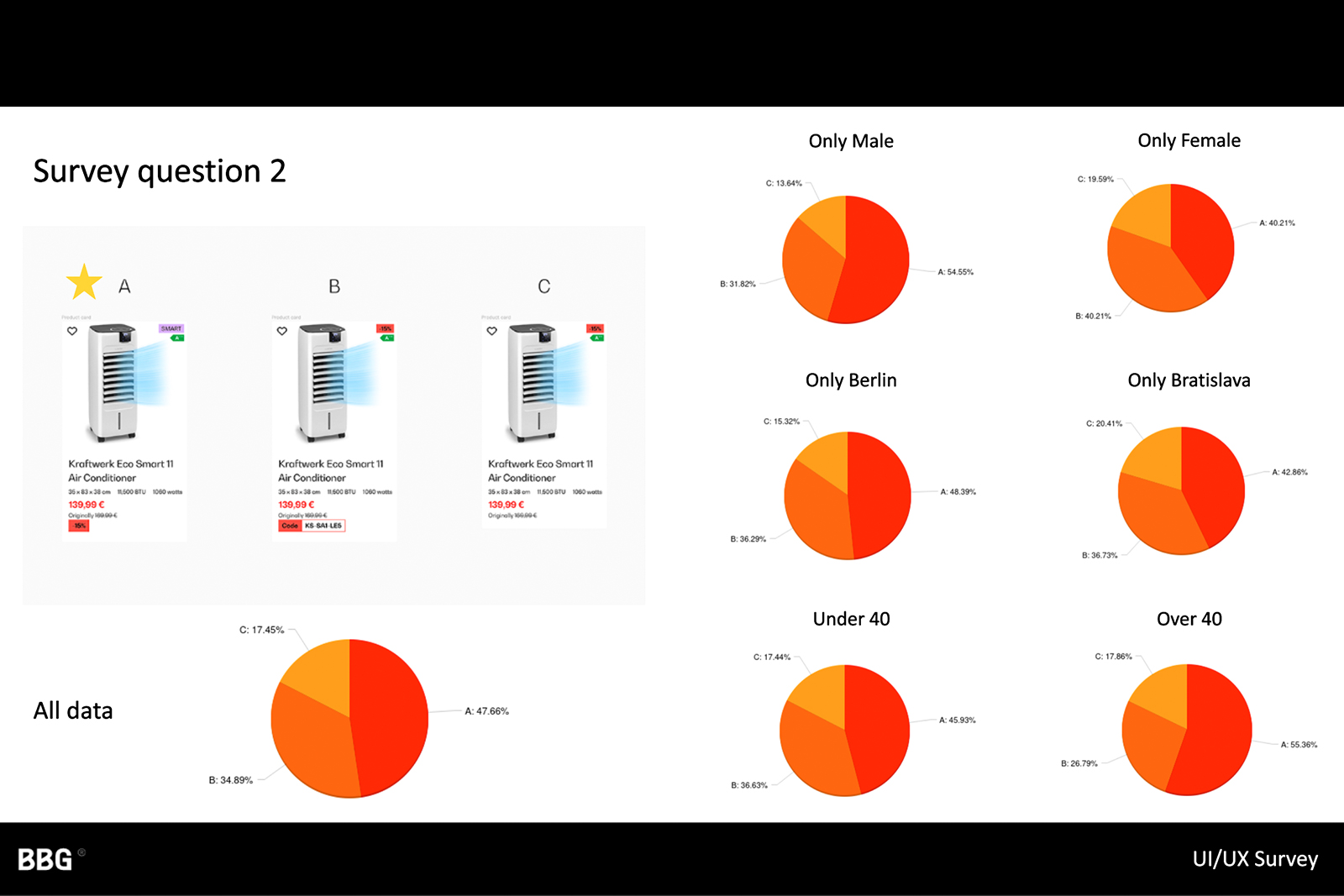
Identified key pain points in brand consistency and development speed.
Revealed best practices for e-commerce checkouts, design systems, and performance optimization.
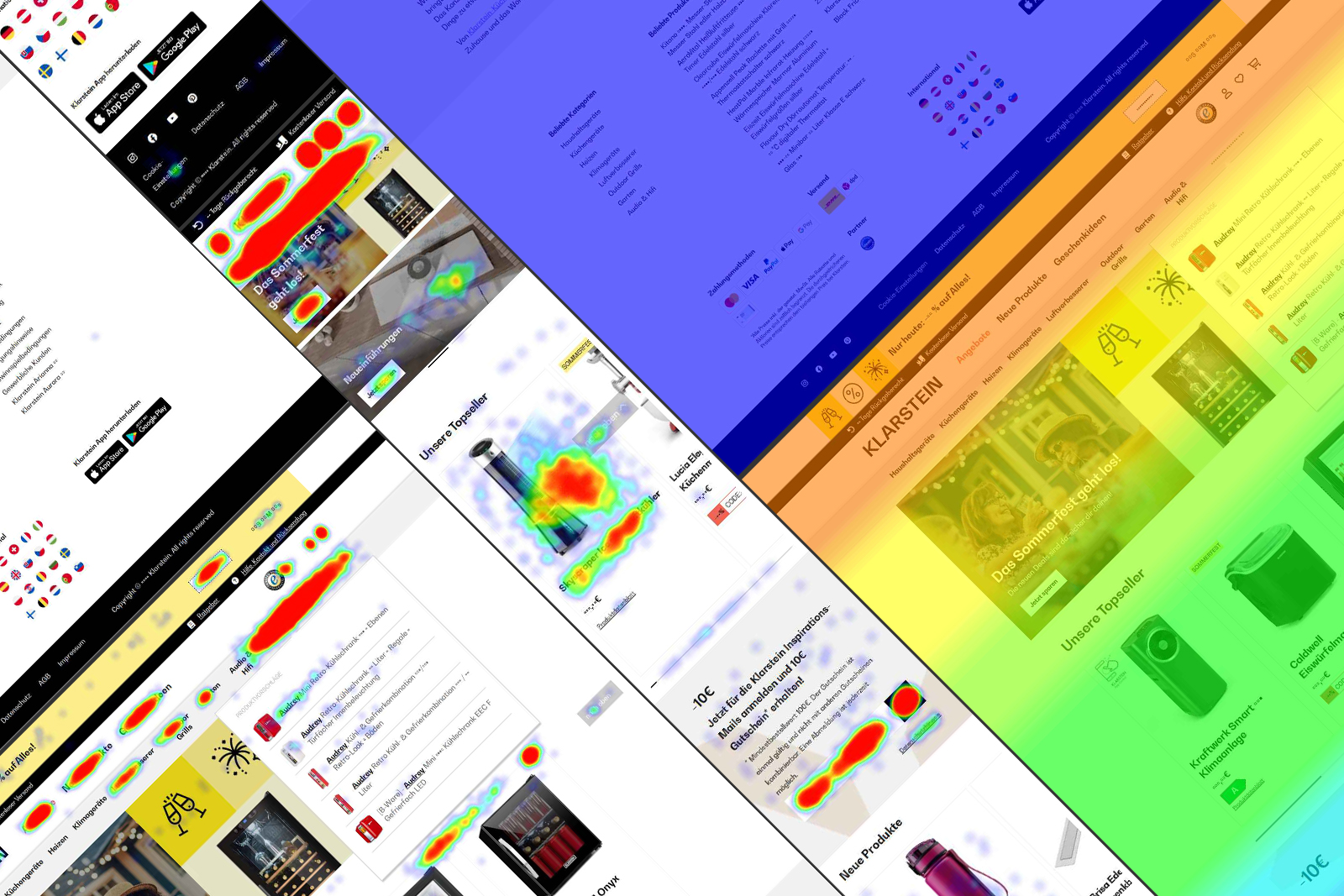
Confirmed that cart abandonment spiked during multi-step checkouts.
Validated earlier findings from stakeholder interviews.
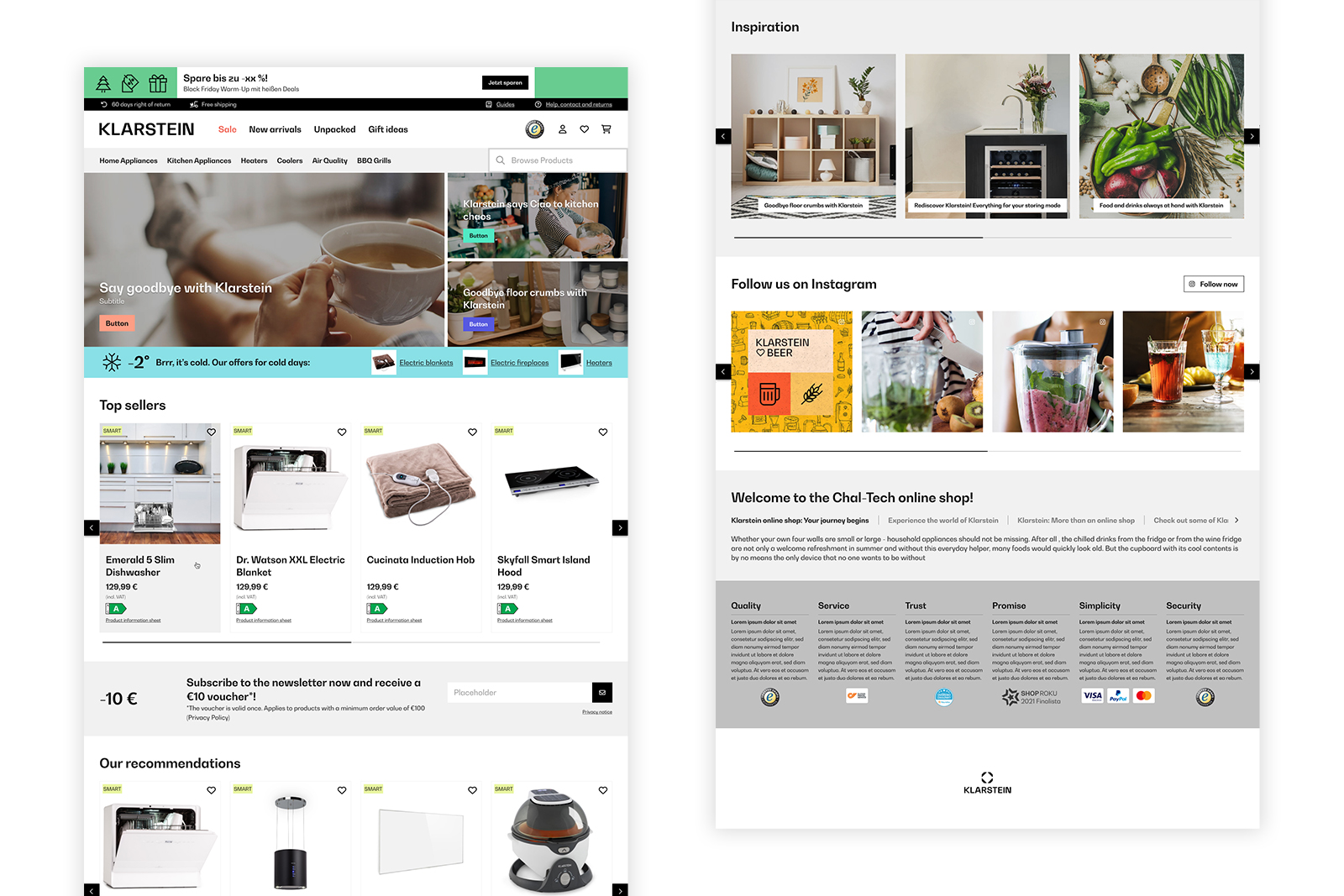
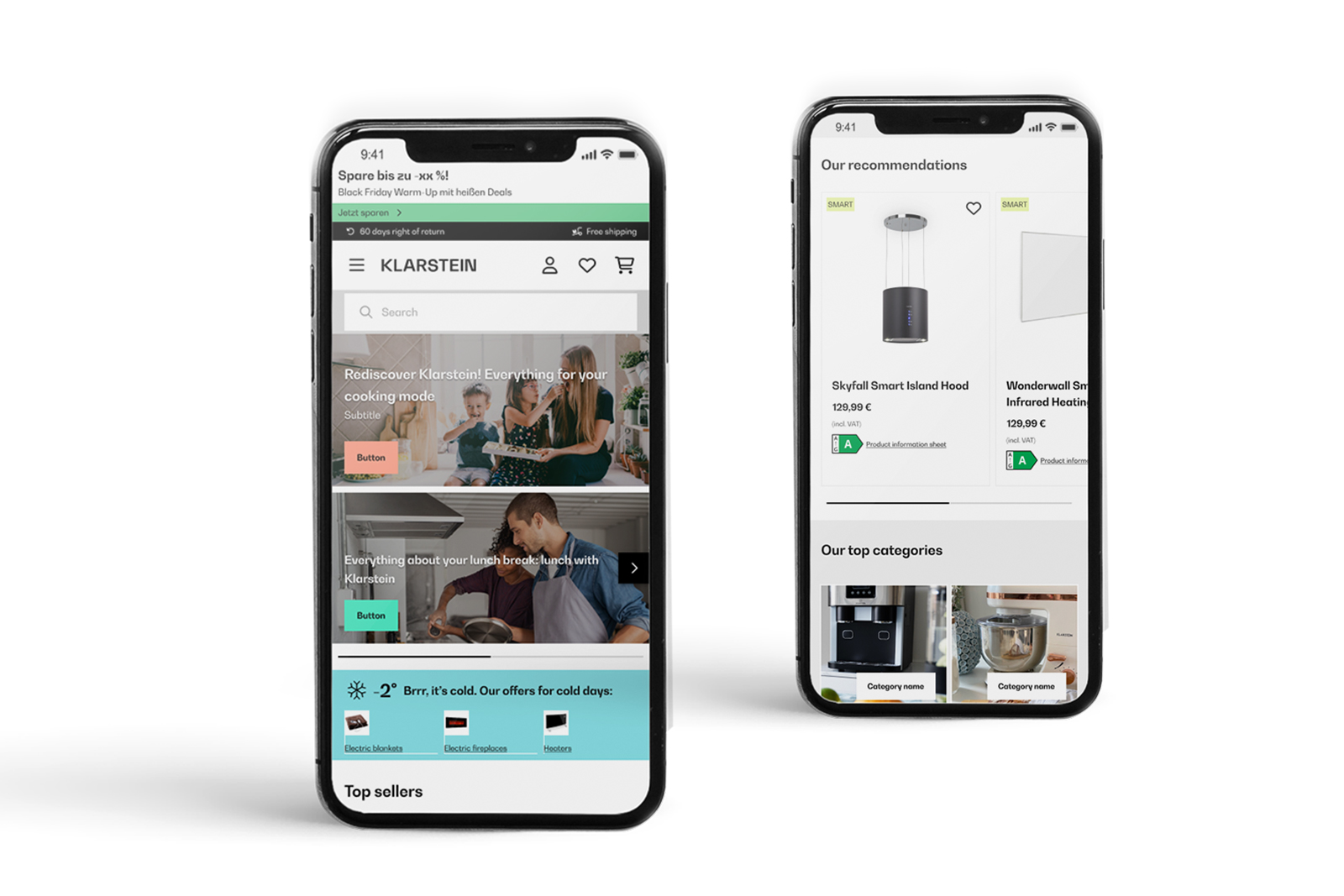
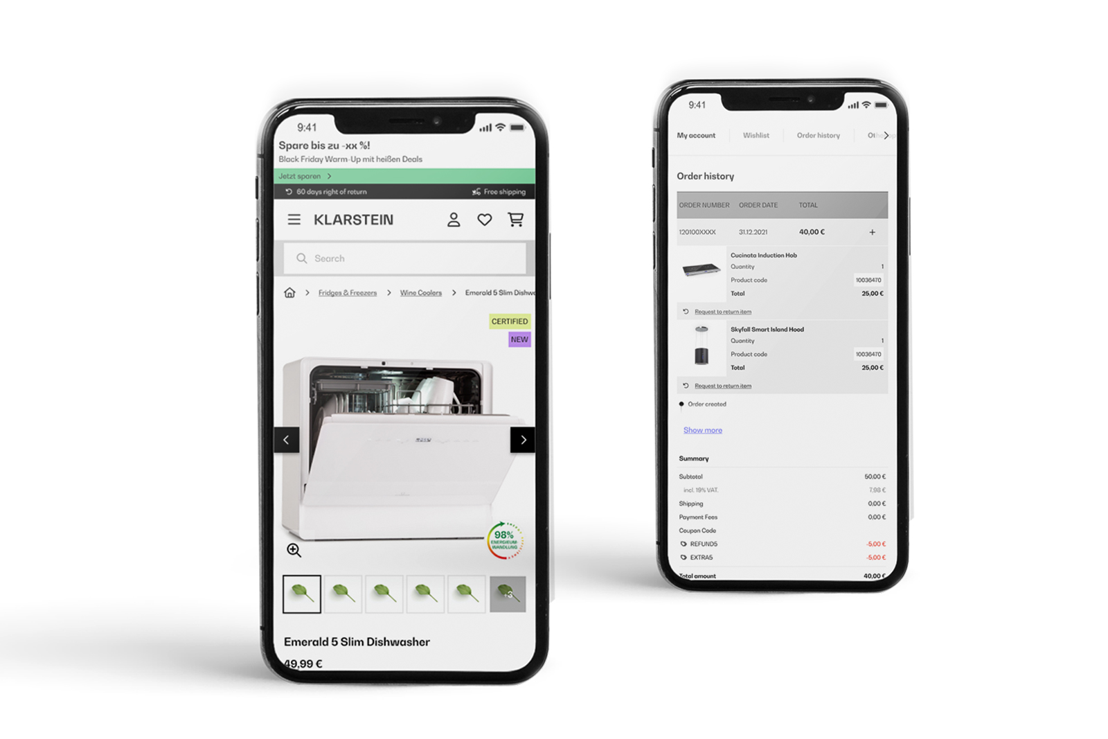
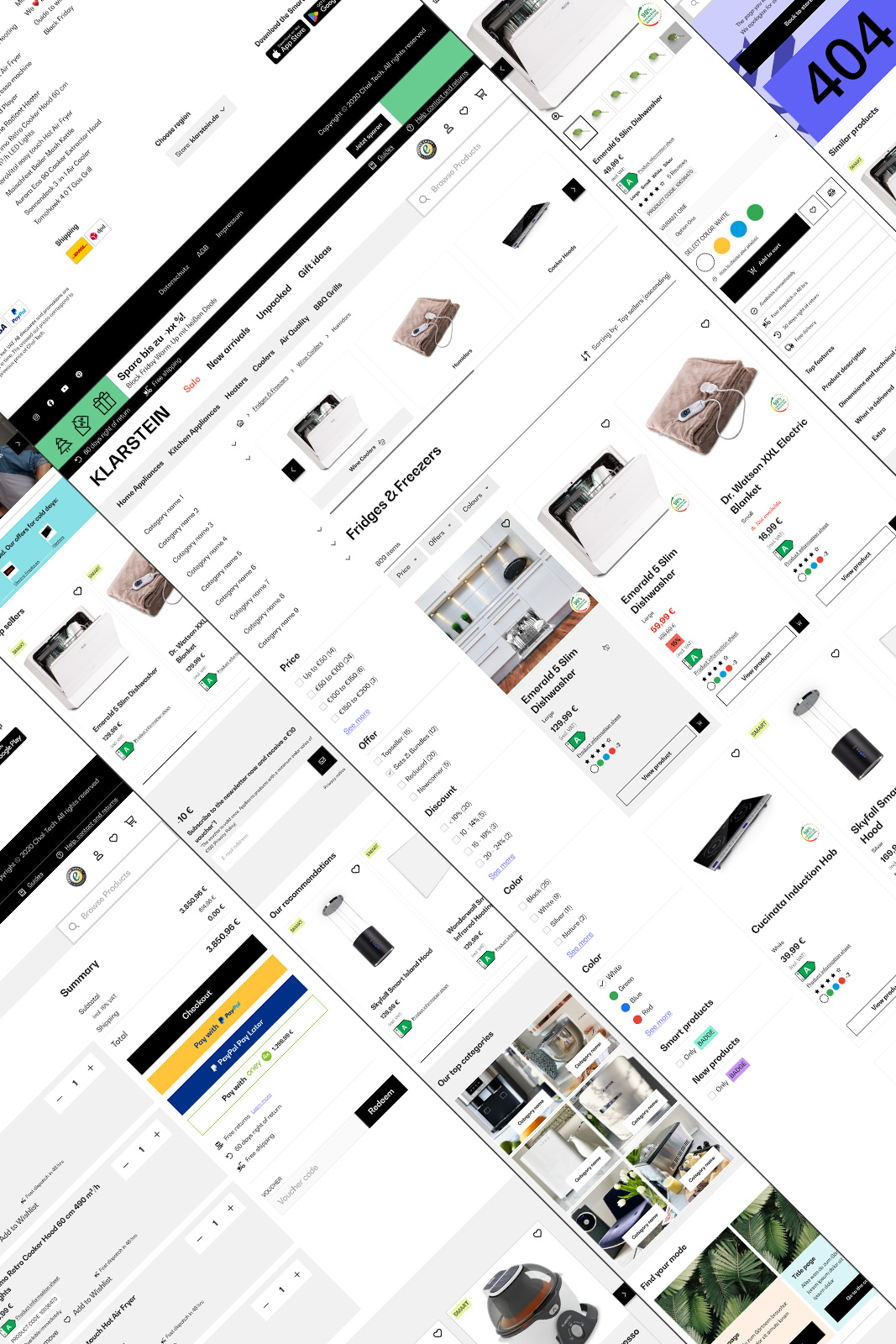
Unified component library, one-page checkout, thorough documentation, sticky sidebar on product pages, repositioned badges.
SEO-optimized content structure, improved product carousels, Hero banner with 3 key promotions.
Dark mode UI, localization for emerging markets, installment payments, pickup point delivery options, accessibility refinements, live chat support widget.
AR product previews, AI-driven personalization, advanced loyalty program integration (future consideration).
Wide product range, loyal customer base, centralized GDS, faster handoff.
Conflicting brand styles, outdated checkout, limited personalization, missing UX features.
Faster brand rollout, localization & flexibility, accessibility & UX trends, future personalization.
Lean competitors, high UX expectations, tech debt risks, localization pressure.
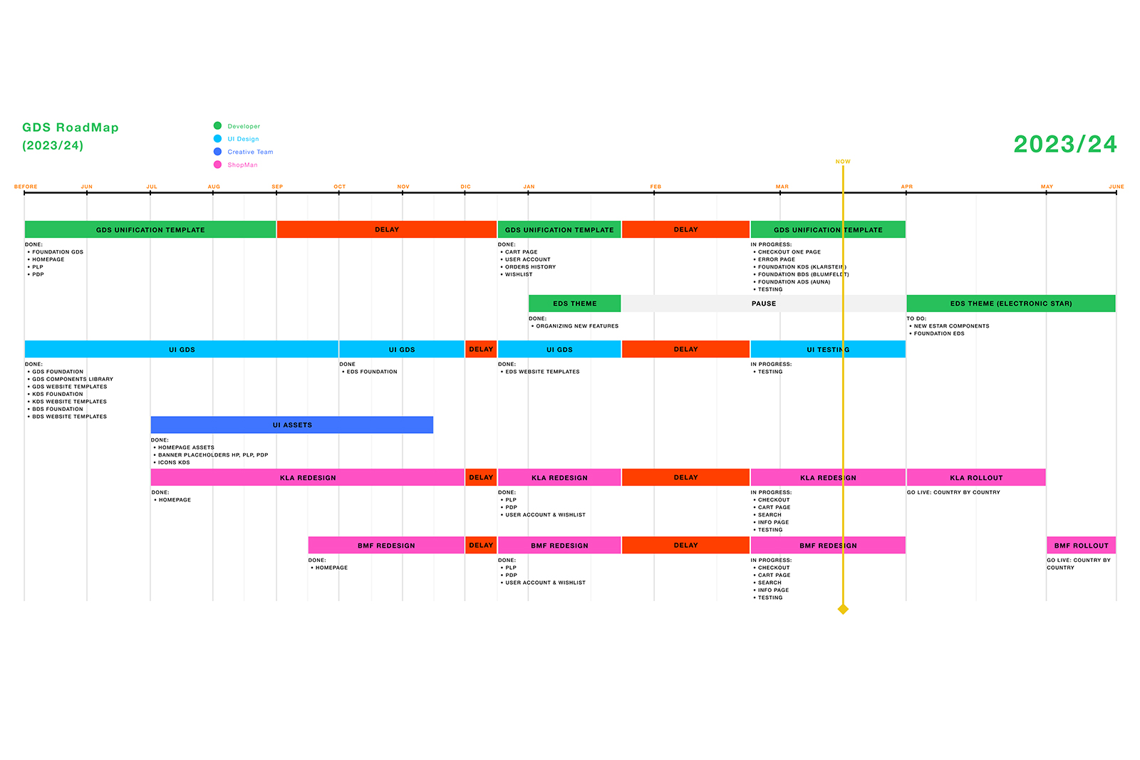
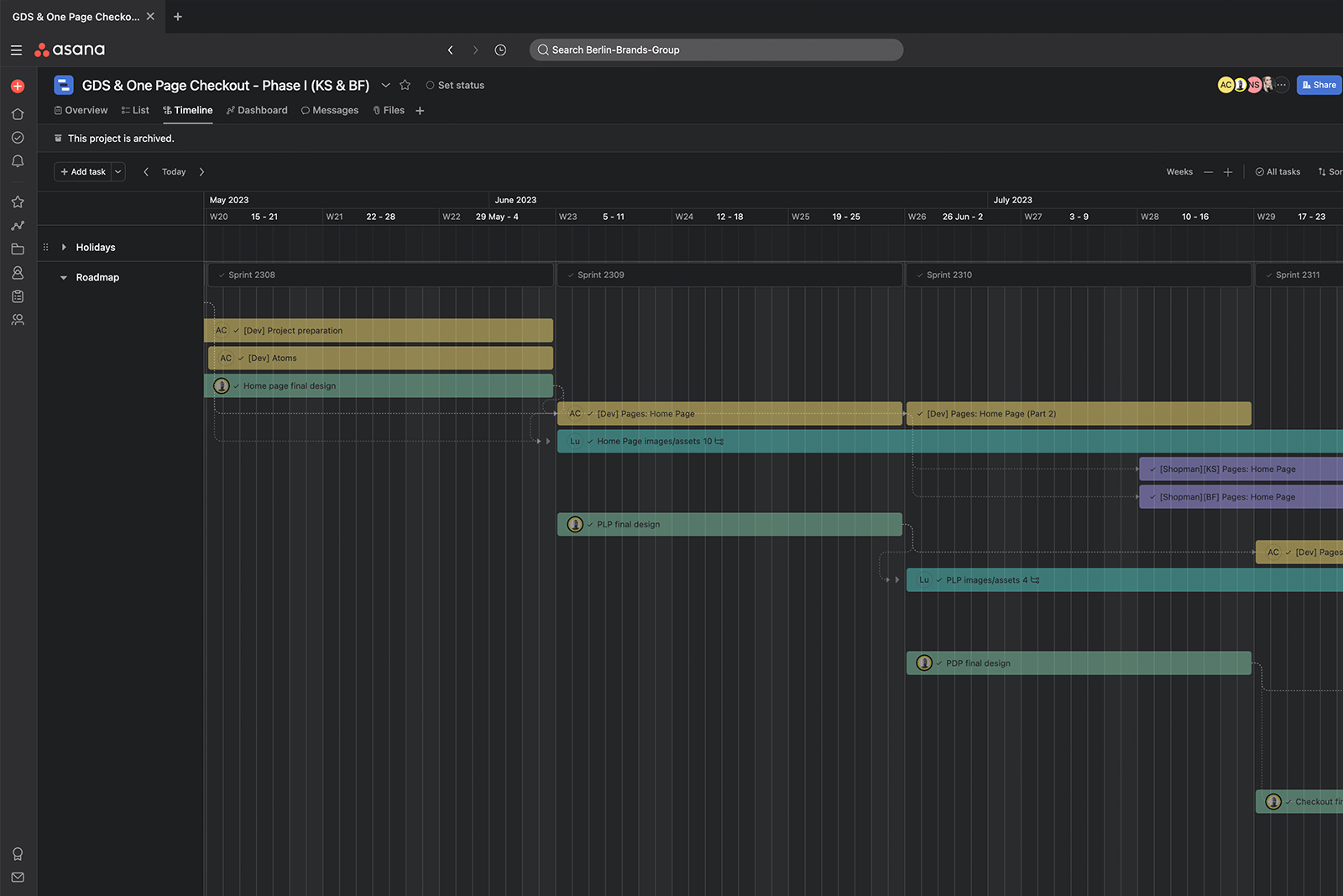
Competitor analysis, stakeholder interviews, scoping the GDS
Building the component library, testing new website templates
Implementing GDS across Klarstein, Blumfeldt, and Electronic Star
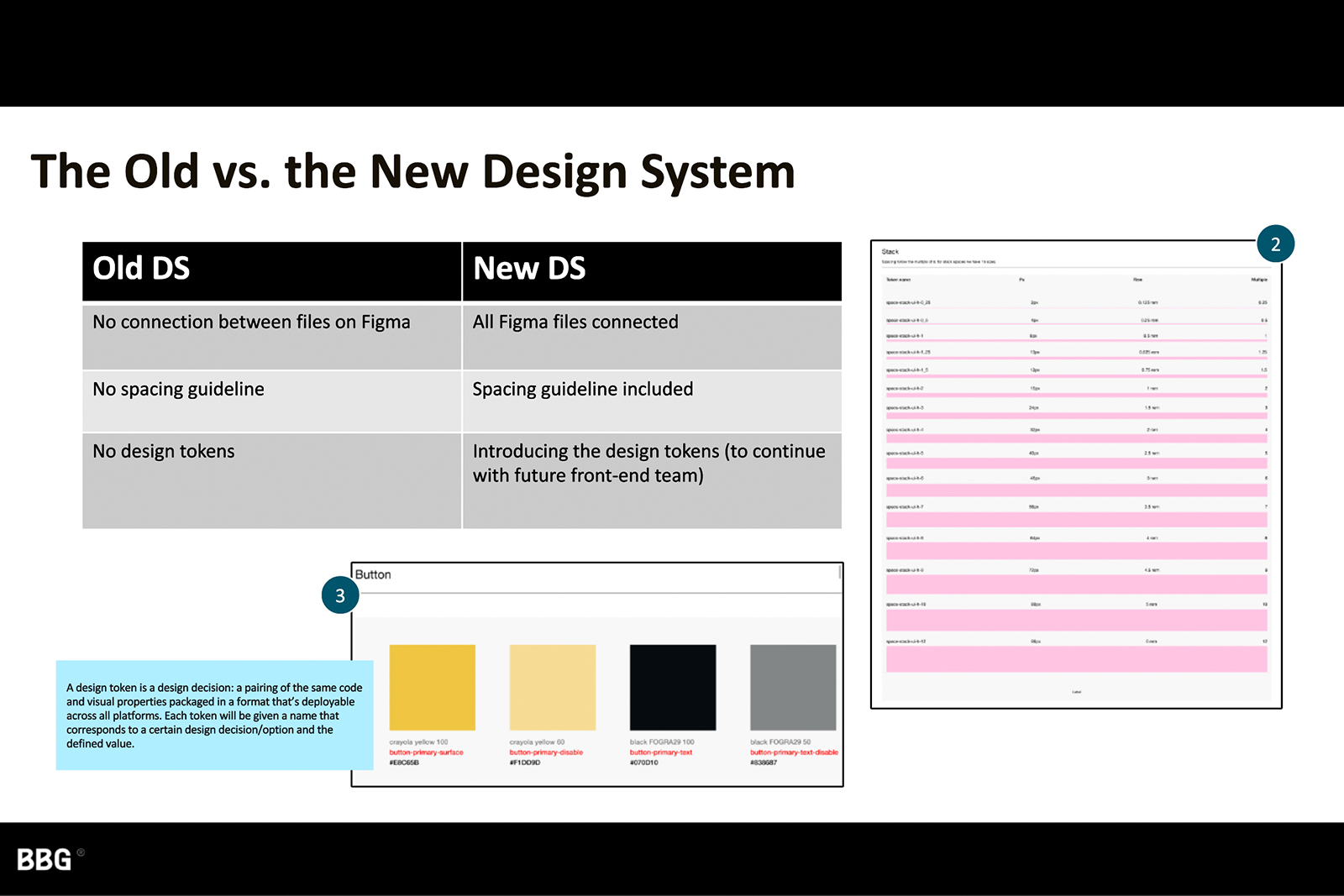
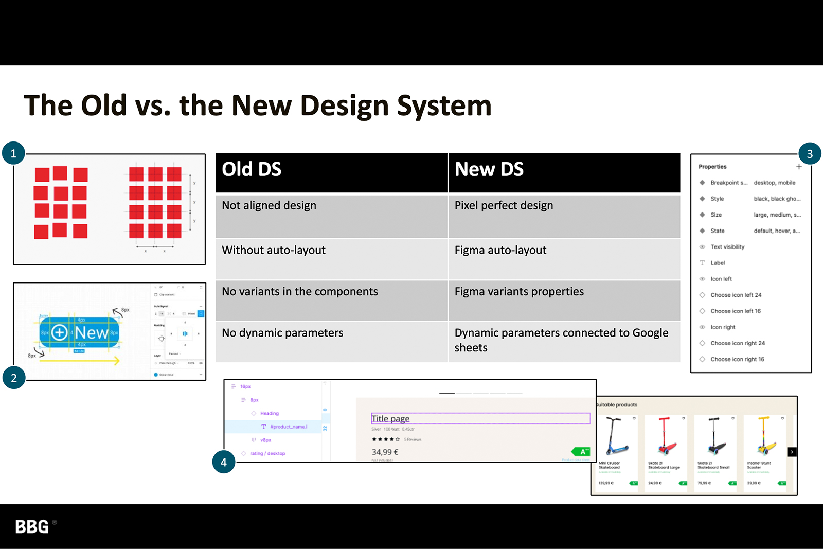
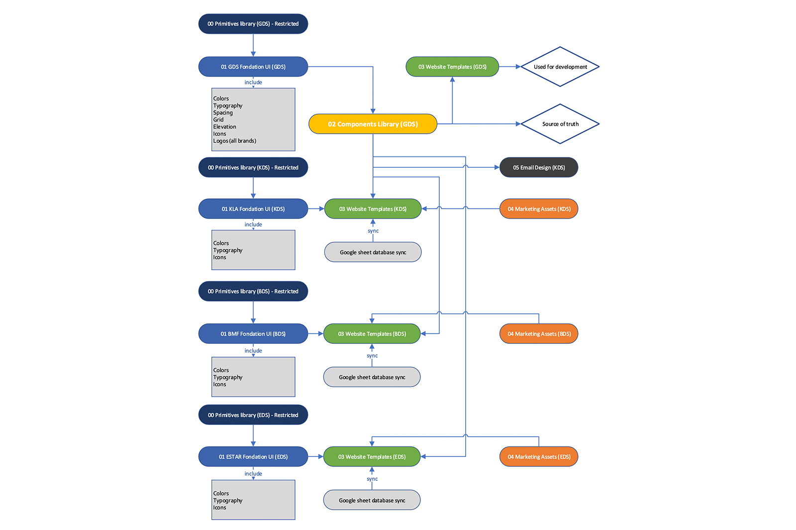
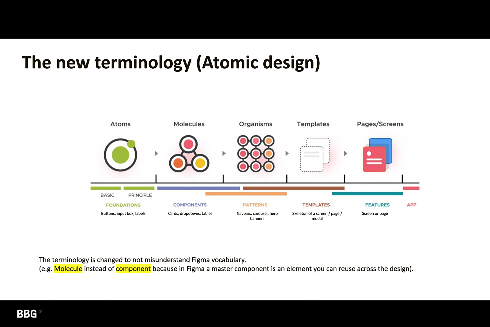
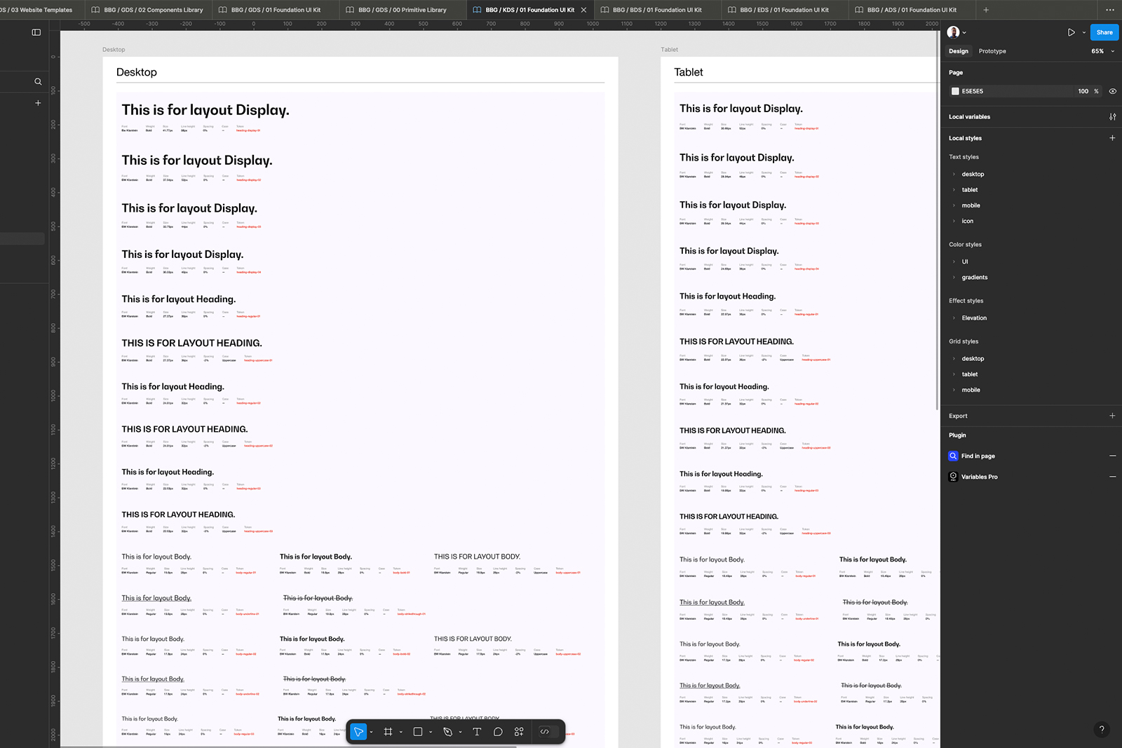
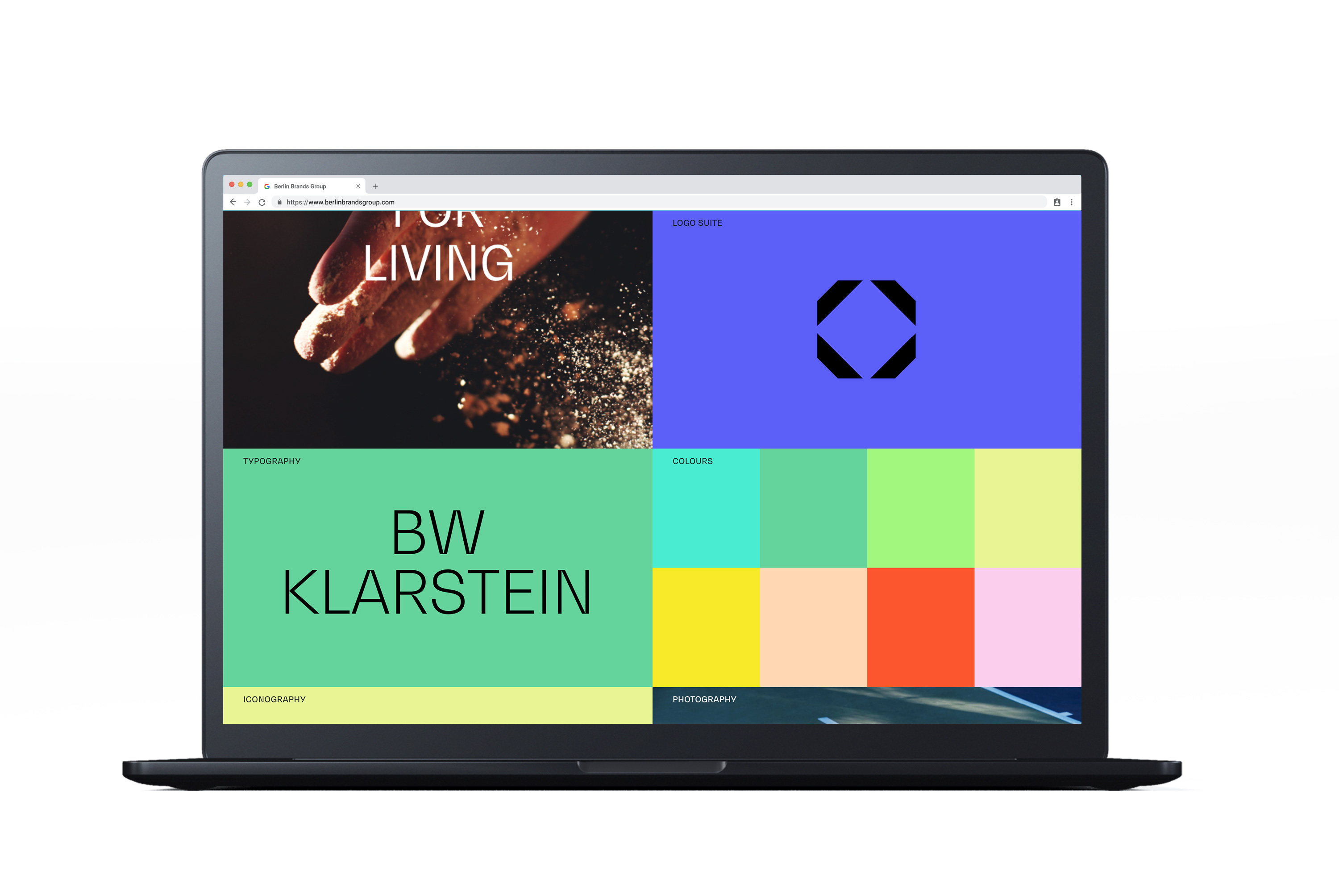
We structured the Figma-based design system into four foundational layers:
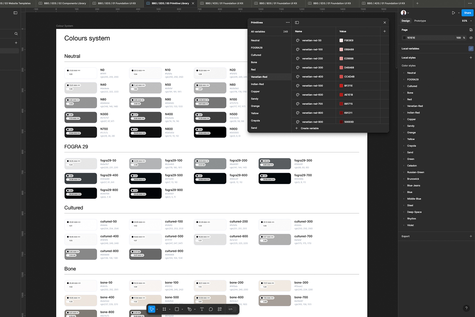
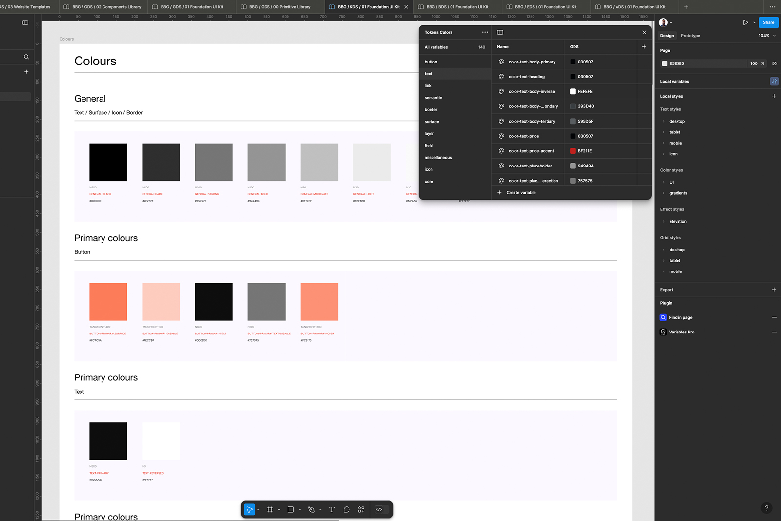
Core color shade variables shared across all brands.
Unique colors, typography, and icons tailored to Klarstein, Blumfeldt, and Electronic Star.
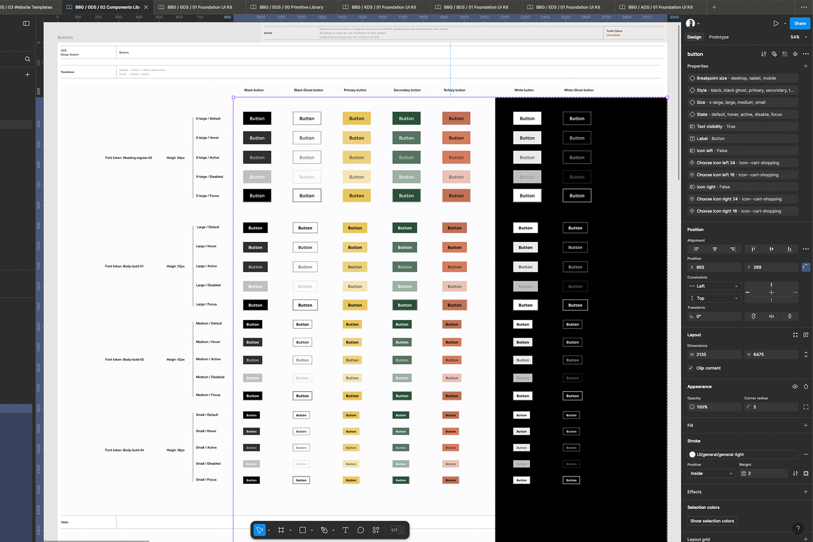
A centralized set of reusable UI components for cohesive product layouts.
Quick-start templates developers could adapt for future brands.
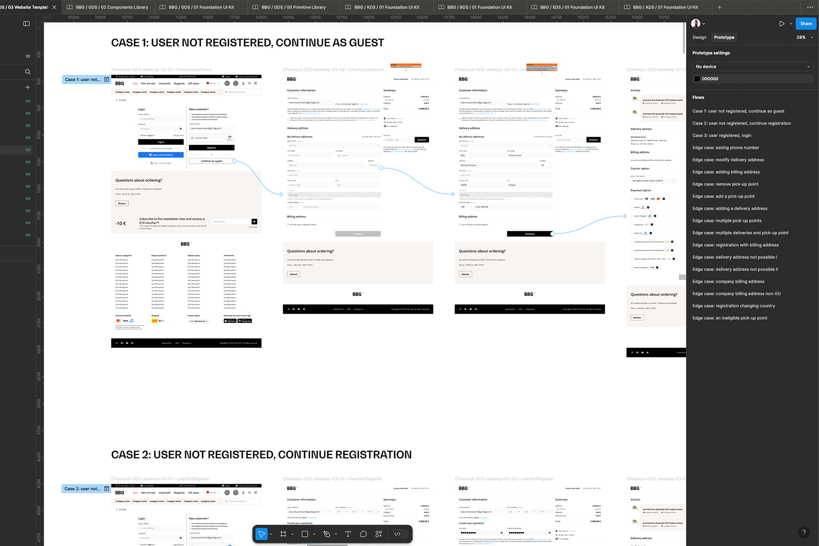
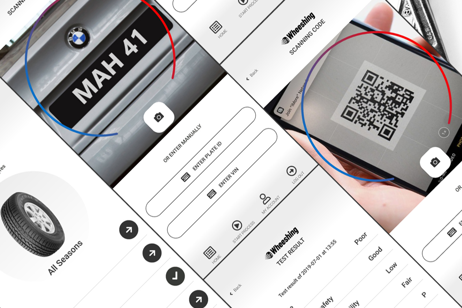
We replaced the 5-click checkout with a single-page flow, reducing friction and user drop-off.
See the related UX Analysis for BBG Webshops case study for deeper insights.
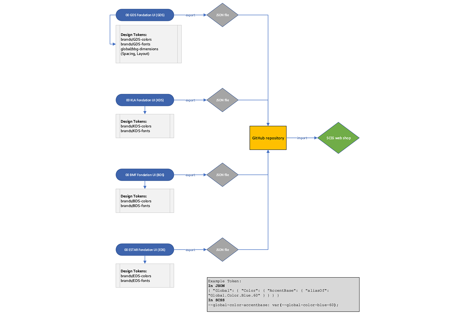
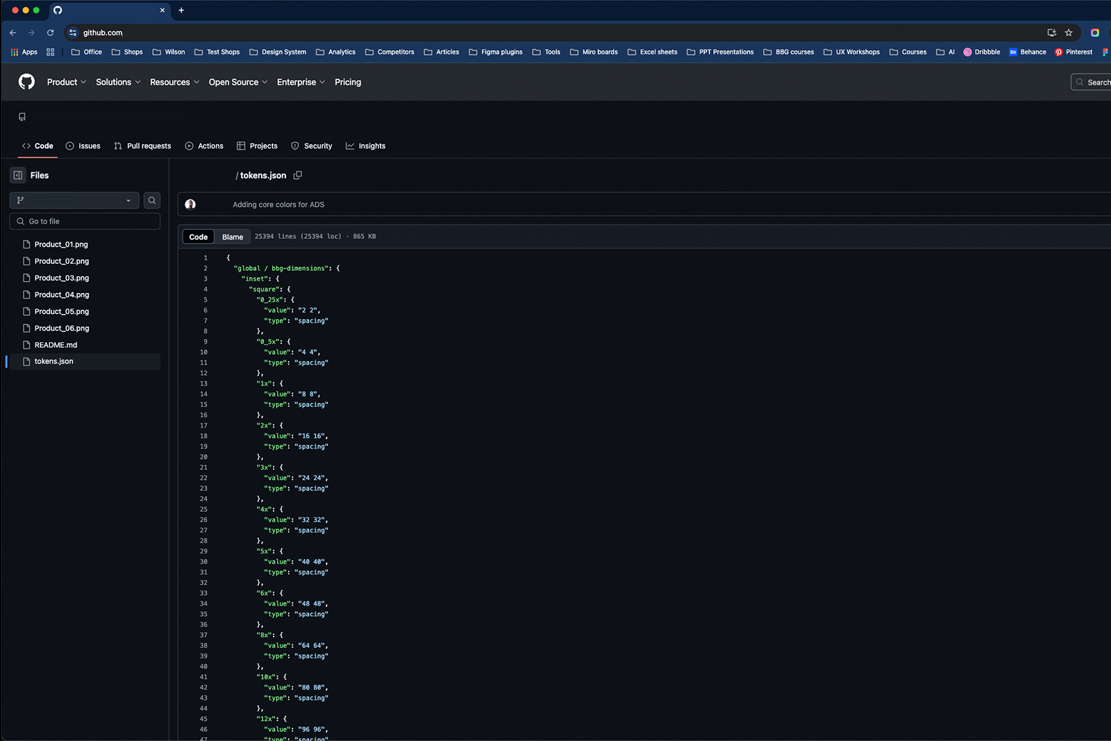
A critical step was exporting design tokens (colors, typography) from Figma into JSON, pushing them to GitHub, and integrating them into SCSS. This approach guaranteed automatic updates whenever a color or style changed in Figma—minimizing manual coding errors and accelerating front-end development.
From Figma into JSON files
Where developers could easily access them
Enabling automatic updates and reducing manual work


GDS was not merely a redesign—it revolutionized how we handle e-commerce across 23 international webshops. By consolidating design assets, we trimmed design-to-development handoff from 10 days to 7, a 30% reduction measured by sprint data (before vs. after GDS). This holistic foundation cut costs, boosted consistency, and empowered our teams to scale faster and innovate confidently.
| Sprint | Pre-GDS (days) | Post-GDS (days) | Improvement |
|---|---|---|---|
| Sprint 1 | 10 | - | - |
| Sprint 2 | 9 | - | - |
| Sprint 3 | 8 | - | - |
| Sprint 4 | - | 7 | 30% (approx.) |
We plan to continuously evolve the GDS by integrating emerging UX trends, refining accessibility, and exploring functionalities like installment payments and pickup point deliveries to further optimize the user journey.
A flexible structure met various branding requirements while maintaining efficiency.
Regular alignment and transparent documentation bridged the gap between design, development, and marketing.
Translating designs directly into code minimized errors and maintained visual consistency across all webshops.
“Working as both a UI/UX Designer and Product Owner gave me a 360° perspective—streamlining the design process while ensuring business and technical alignment across 23 international brands.”

Explore my UX analysis of BBG webshops, where I improved checkout flow, banner placements, search functionality, product selection, and accessibility. Dive into the full story here!
Read more