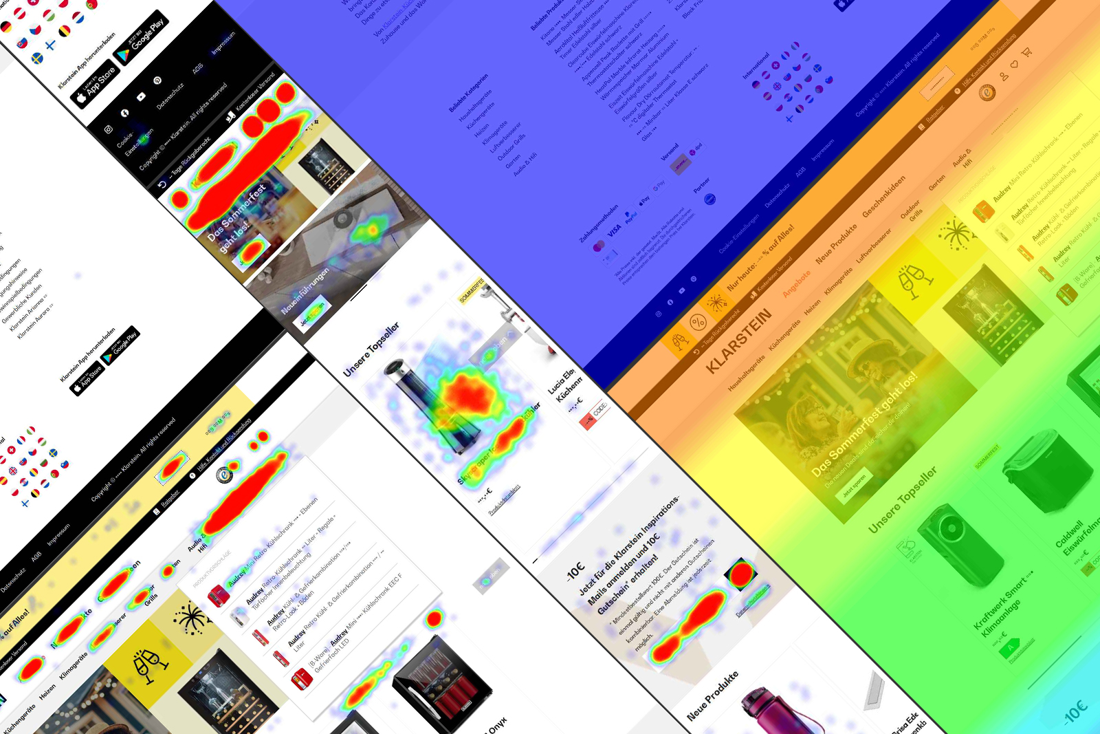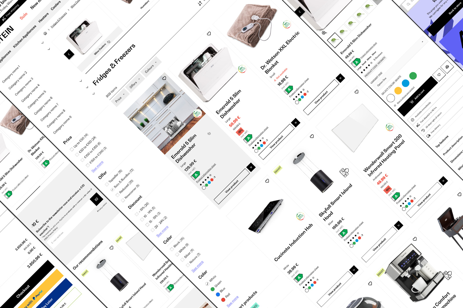
BBG Global Design System
Since 2023, GDS powers Berlin Brands Group with a scalable, cohesive design for all webshopsView case study

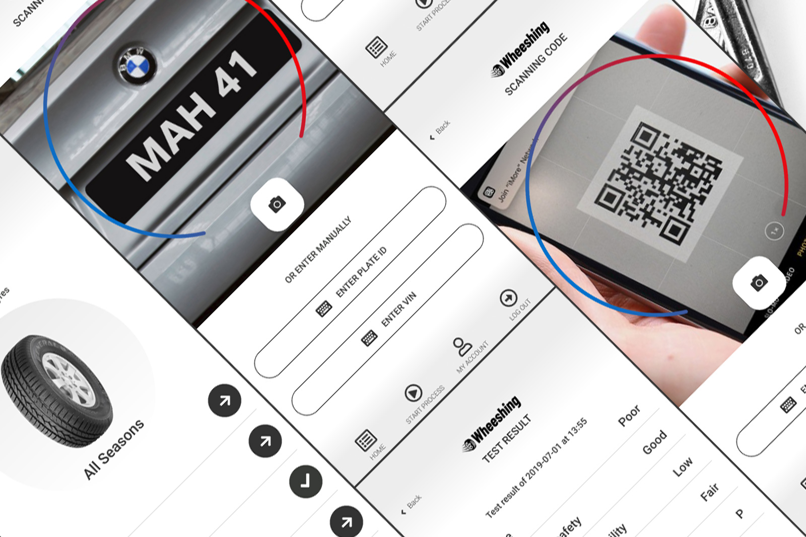
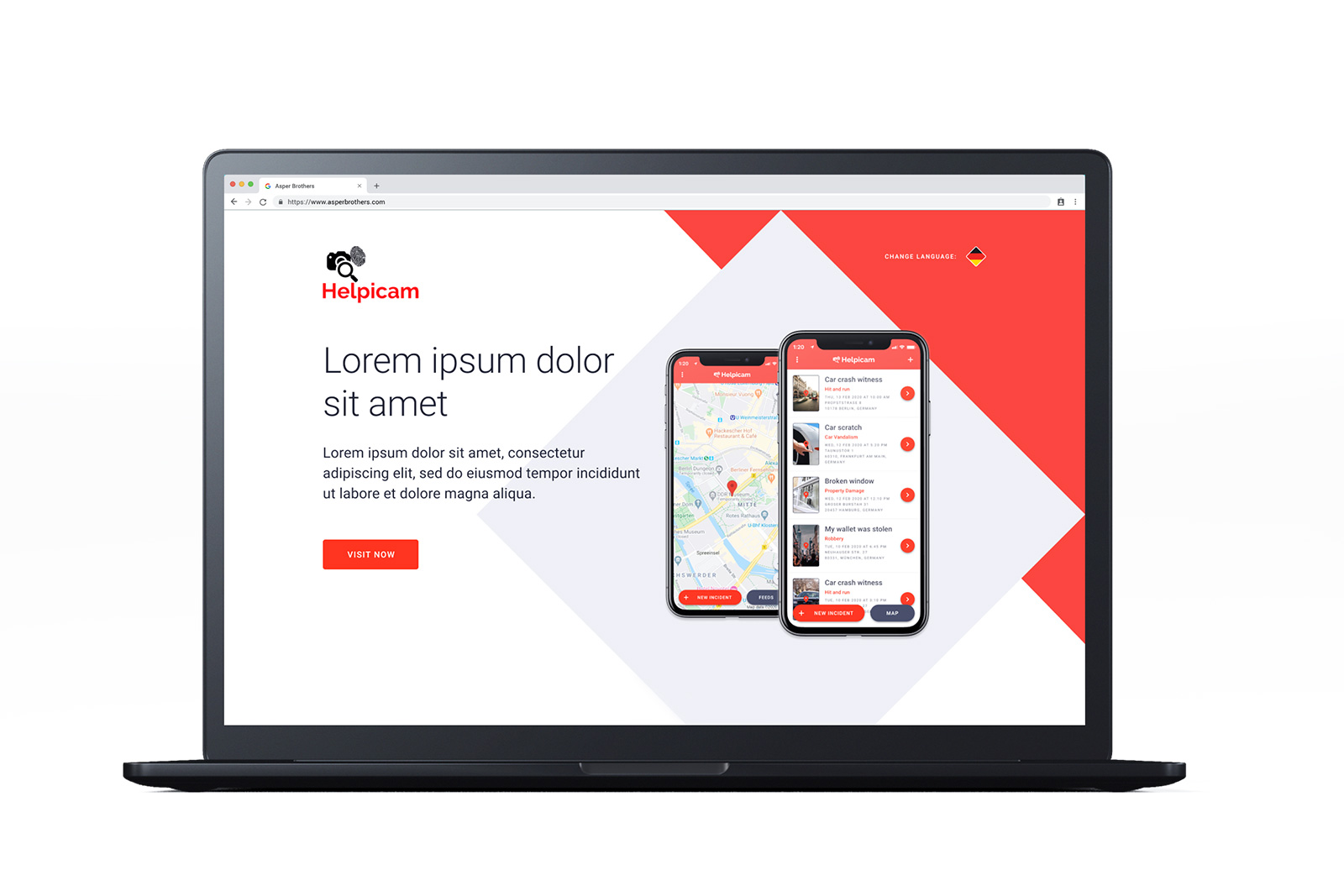
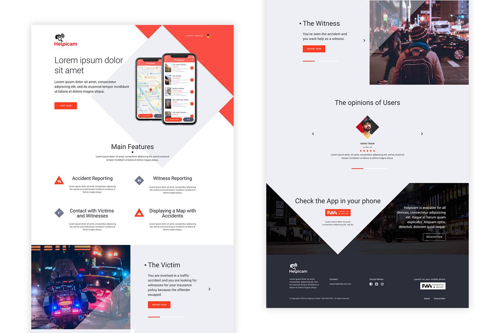
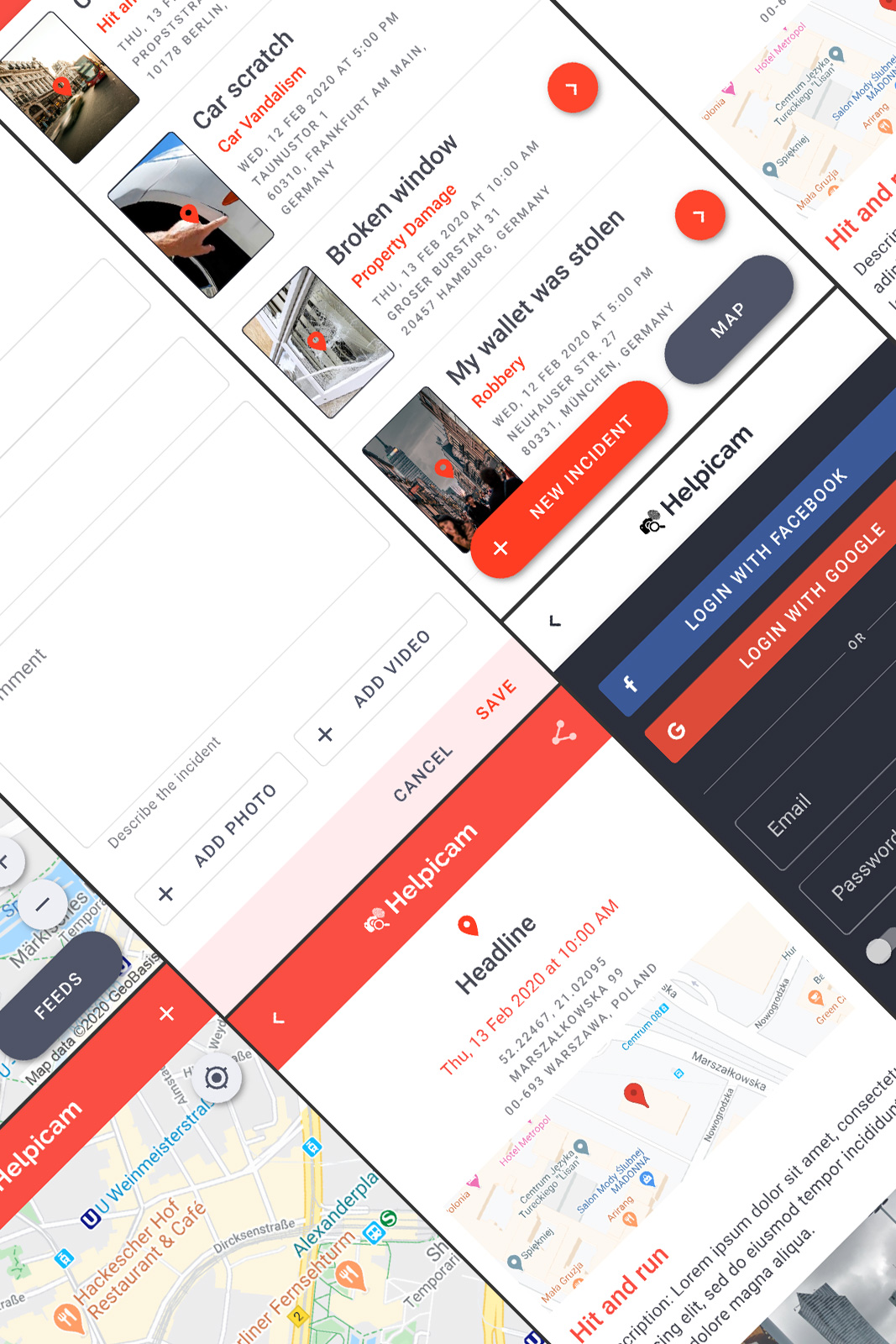
Helpicam is a Progressive Web Application (PWA) designed to assist people in reporting street incidents, either as witnesses or victims. Collaborating with Asper Brothers, we transformed the client’s initial idea into a functional and user-friendly product.
Asper Brothers, Warsaw (PL)
Figma, MoSCoW Method
UI/UX Designer
Reporting street incidents can be tricky. Many existing apps are either too complicated or miss out on essential features, leaving users frustrated. Our goal was to create a tool that’s simple, fast, and effective, making it easier for people to report incidents and get help when they need it most.
As the UI/UX Designer, I was involved in every step of the process—from understanding the user’s needs to delivering a fully functional design system. My key responsibilities included:
The first step was diving deep into understanding our users—who they are, what challenges they face, and what they expect from an app like Helpicam. We ran brainstorming sessions with the client and analyzed competitor apps to identify gaps and opportunities.
To stay focused, we used the MoSCoW method, which helped us categorize features based on their importance. This prioritization kept us on track and ensured we delivered the core value to users first. Here’s how we approached it:
Prioritizing user needs and ease of use.
Ensuring information is presented clearly and concisely.
Maintaining uniformity in design elements throughout the application.
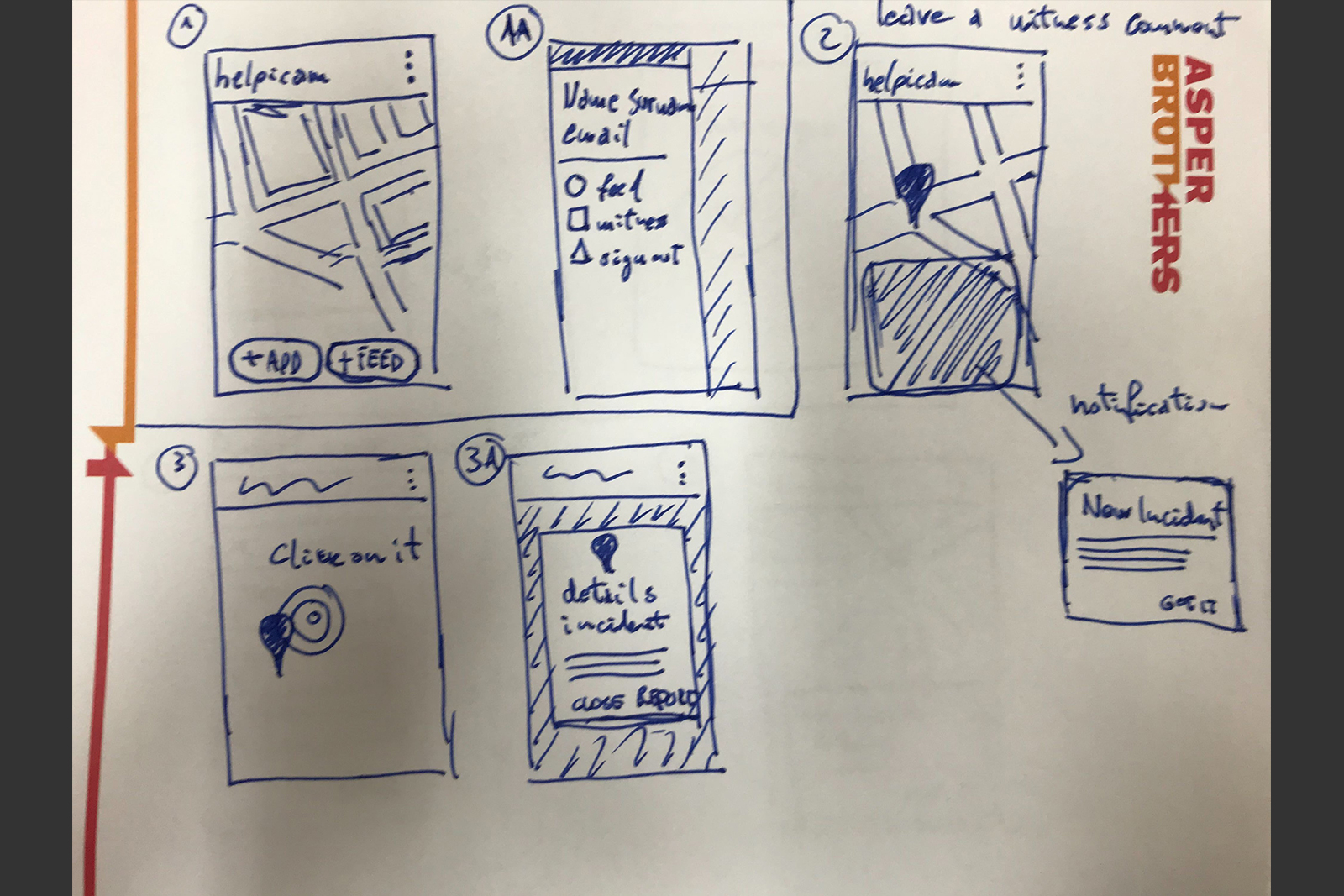
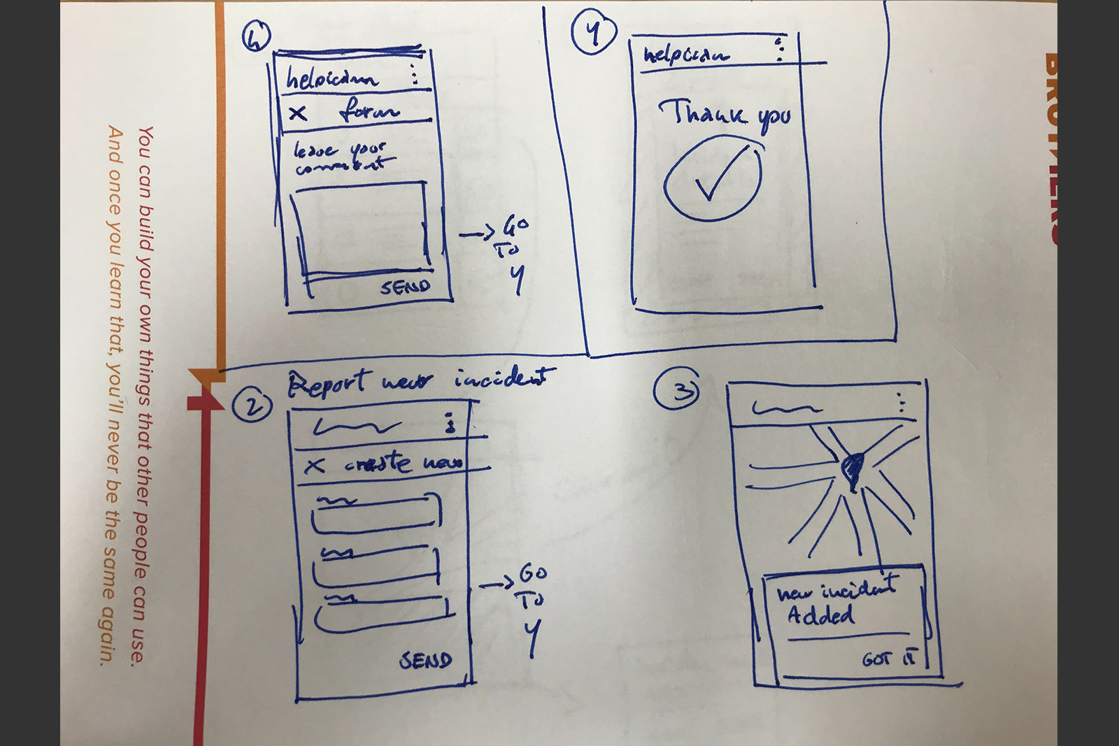
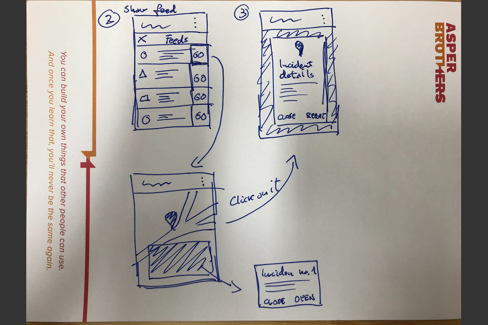
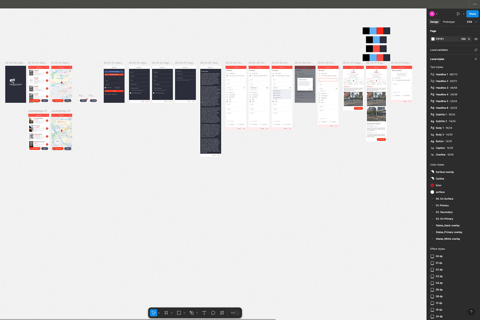
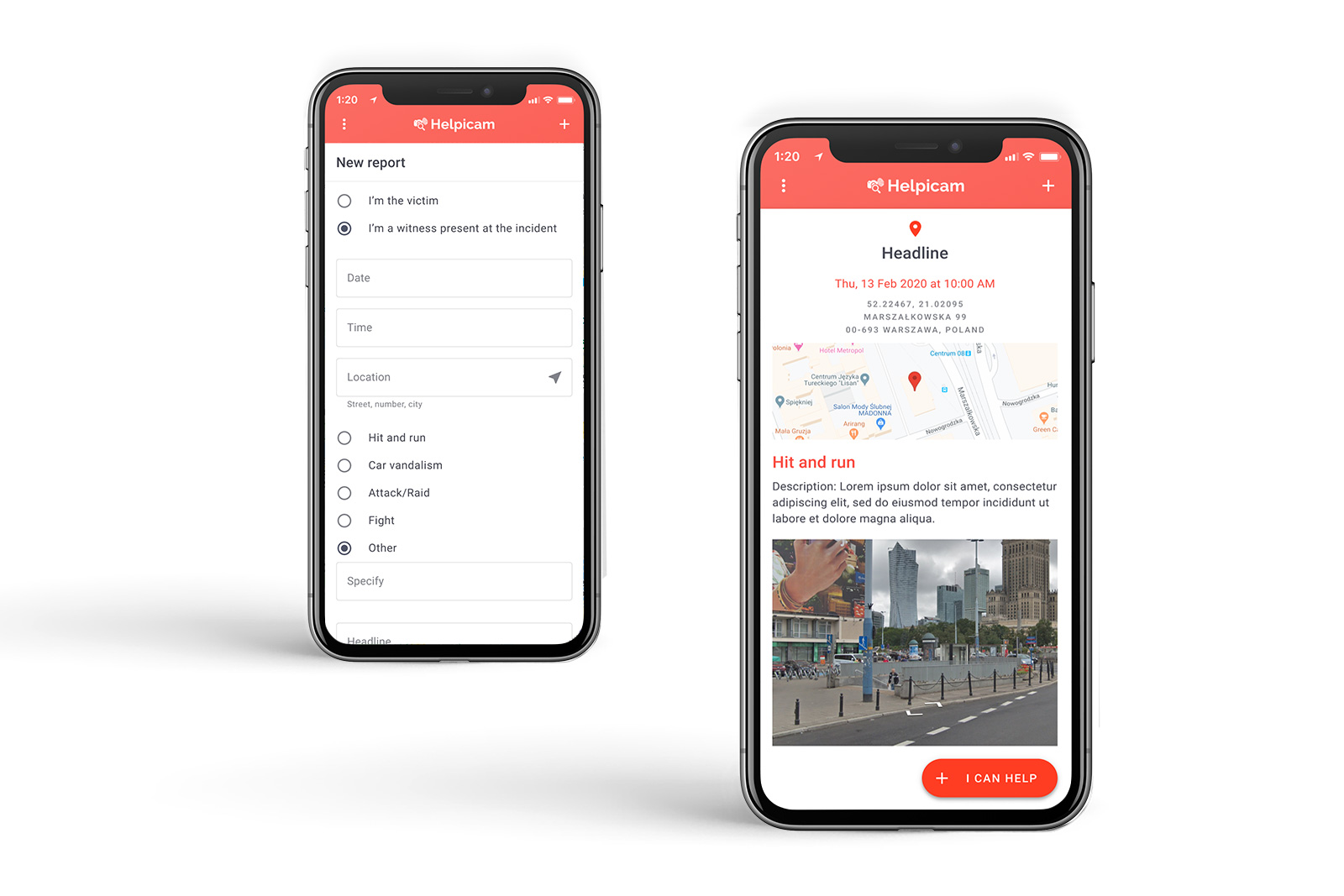
Once the features were defined, I started sketching out ideas and created low-fidelity wireframes to map out the app’s structure. The focus was on making the navigation simple and intuitive, ensuring users could report incidents in just a few taps.
Simplified navigation
Clear call-to-action buttons
Logical placement of reporting features
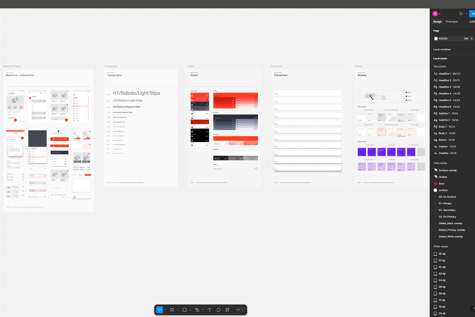
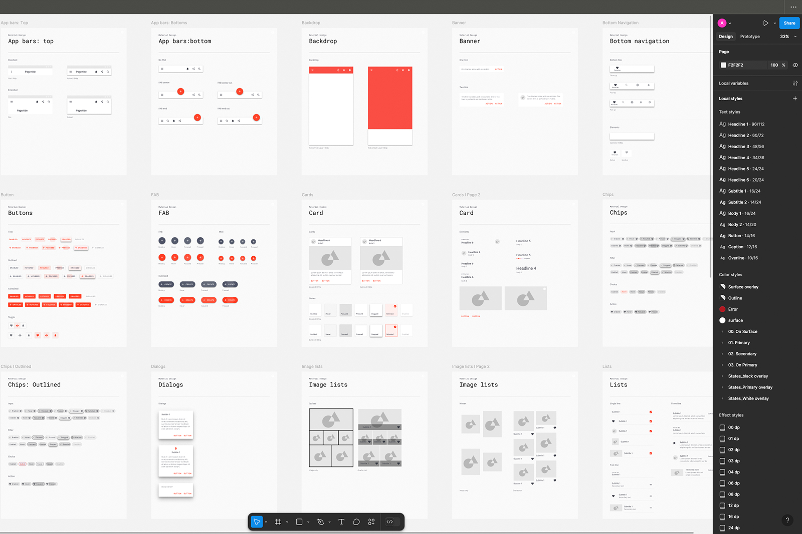
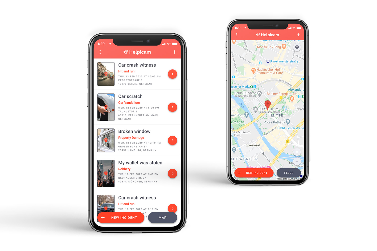
After finalizing the wireframes, I moved on to high-fidelity prototypes using Google Material Design guidelines to ensure a clean and consistent look. We tested different layouts and flows to see what resonated best with our users.
Google Material Design components for coherence
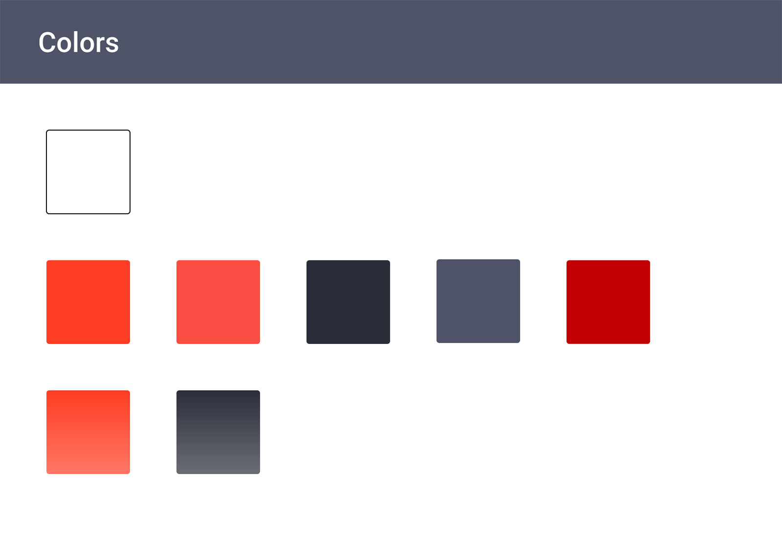
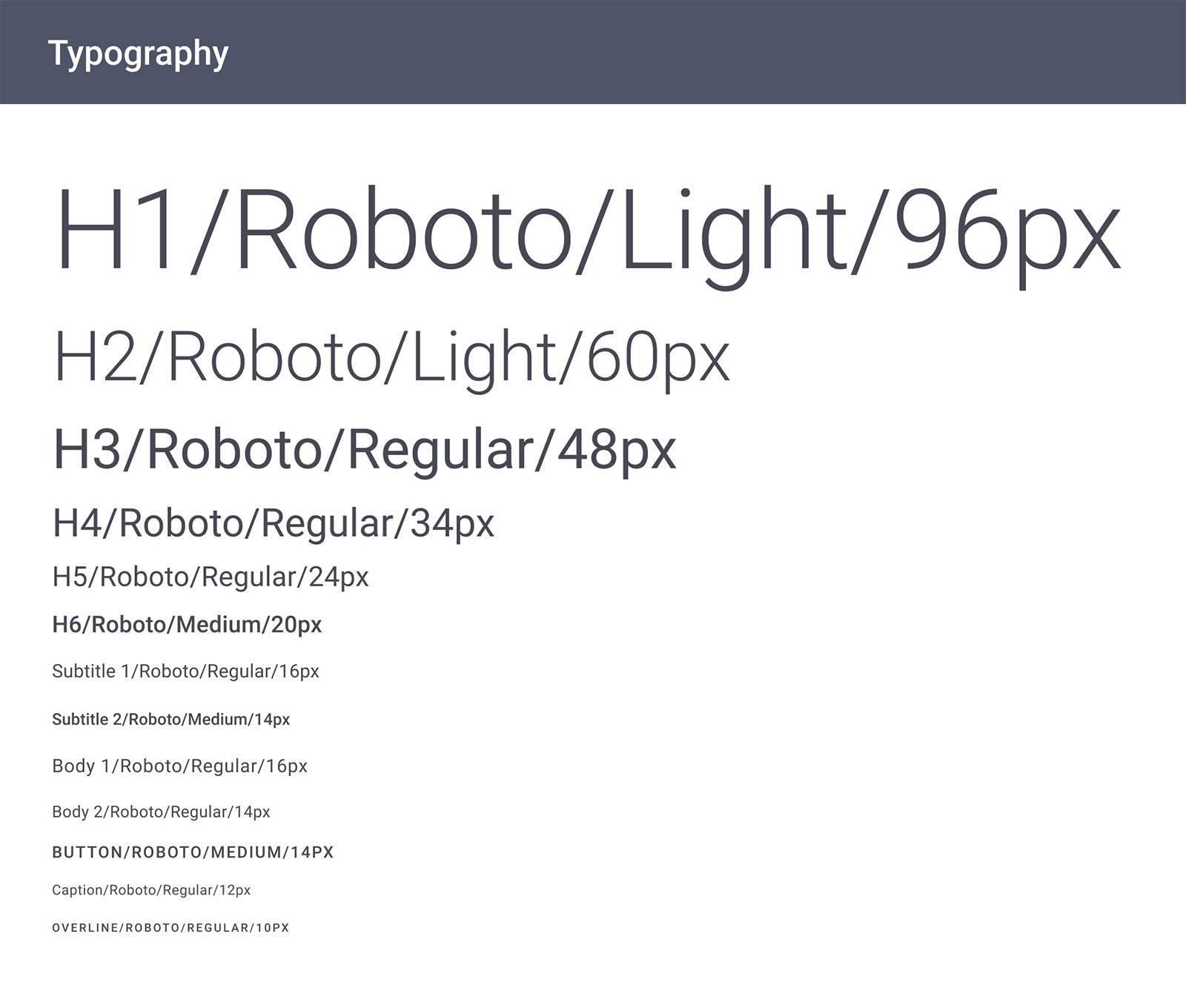
A refined color palette and typography
Interactive elements to simulate real user interactions
We conducted several usability tests with a diverse group of users to identify any pain points. The feedback was insightful! Some key improvements we made based on their input included:
Making the bottom menu more distinguishable from the background
Adding clear labels to input fields
Introducing a "Back" button for easier navigation
Providing more detailed information in the dashboard, such as timestamps and incident details
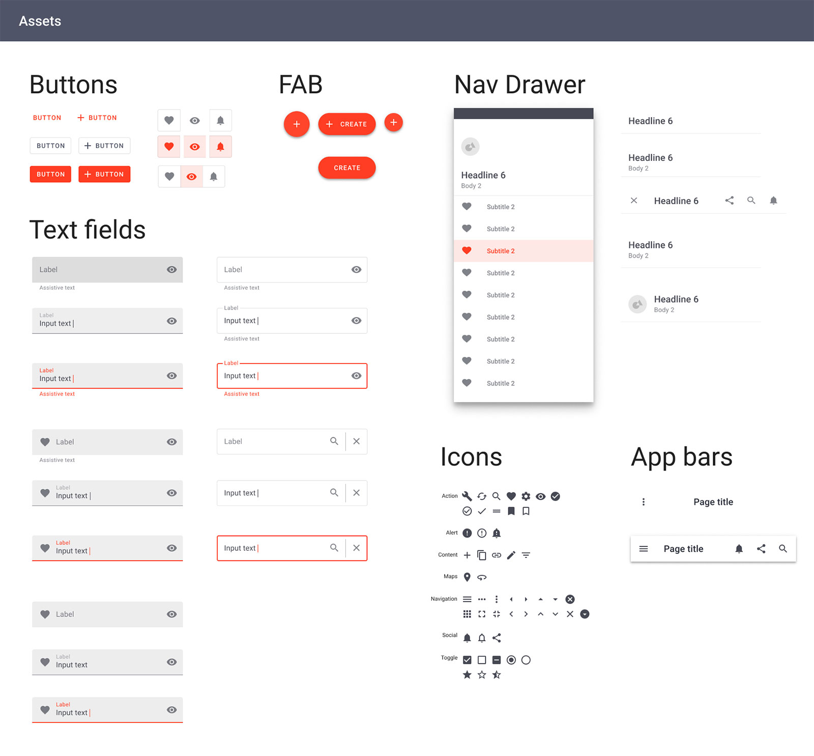
To ensure consistency and speed up development, I built a design system that included:
A well-defined color scheme and typography choices
Standardized UI components like buttons, forms, and icons
Guidelines for spacing, alignment, and responsiveness
Challenge: Balancing comprehensive reporting features with a simple user interface.
Solution: We wanted to keep the app simple without sacrificing essential features. To achieve this, we focused on intuitive layouts and progressive disclosure—showing only the most relevant information at each step.
Challenge: Ensuring the application is accessible to a diverse user base.
Solution: Our target audience included users of varying tech literacy. We followed accessibility standards, including high-contrast colors, readable fonts, and voice-over compatibility to ensure everyone could use the app easily.
Challenge: Efficient Communication with Developers.
Solution: Handoff to developers was smooth thanks to the design system and detailed annotations within Figma. We maintained an open line of communication to address any challenges that arose during development.
Helpicam evolved into a practical, easy-to-use app that empowers people to report incidents quickly and efficiently. The app was well received, with positive feedback from test users who appreciated its clarity and usability.
Reflecting on this project, here are a few things I learned:
Working closely with the client and developers ensured the product aligned with both business and user needs.
Early and frequent testing helped us refine the experience significantly.
Using methods like MoSCoW helped us focus on what truly mattered.