BBG Global Design System
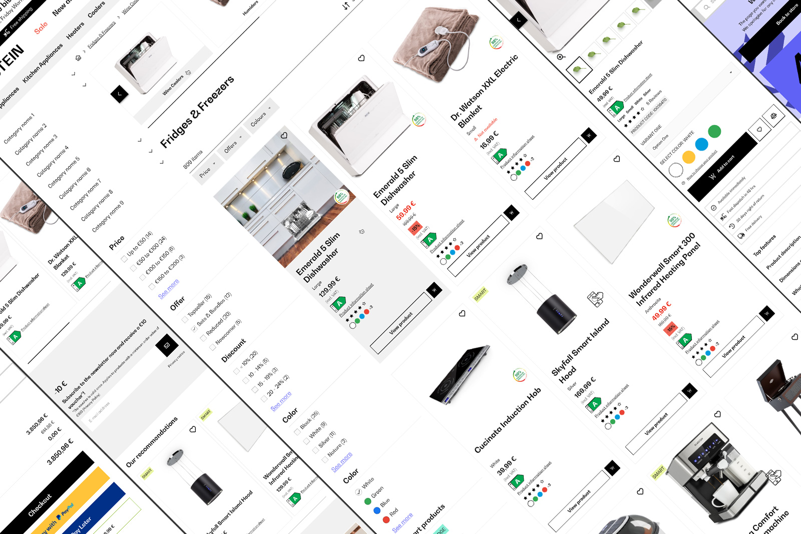
Since 2023, GDS powers Berlin Brands Group with a scalable, cohesive design for all webshopsView case study
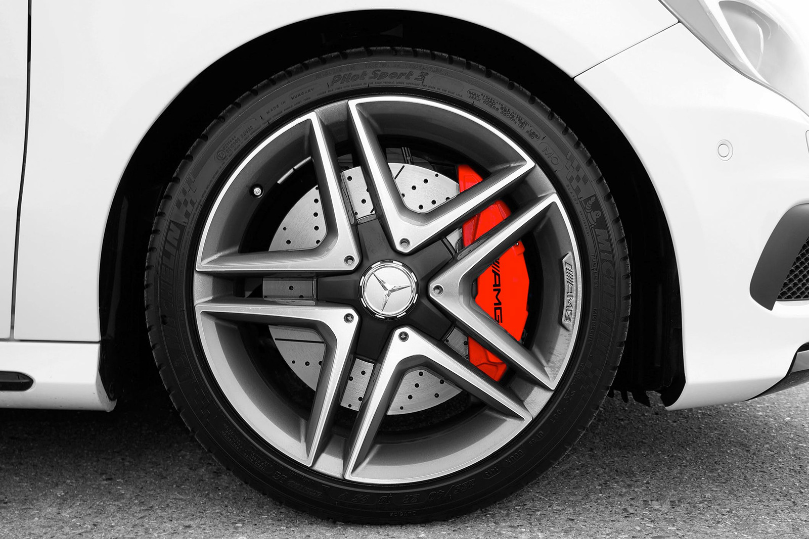
Wheeshing is a blend of the words "wishing" and "wheel," an app designed to make tire replacement easier for both mechanics and car owners. I developed the brand name to reflect the core mission of the application. The real app exists under a different name, but due to copyright reasons, I created the "Wheeshing" brand while keeping the same core concept and features. This concept is based on a real project I worked on for a client, with some added enhancements to improve the user experience.
Asper Brothers, Warsaw (PL)
Figma, User Interviews, Jira
UI/UX Designer
Finding and replacing the right tire can be a hassle. Mechanics often struggle with outdated systems to find the right tires for their customers and communicate effectively with car owners. Existing solutions lack simplicity and intuitive usability, leading to inefficiencies in the process. Wheeshing aimed to bridge this gap with an intuitive app that simplifies the entire process.
As a UI Designer, I created the design system to ensure consistency, scalability, and efficiency in the product's visual identity.
As a UX Designer, I conducted in-depth user interviews before designing the wireframes and later conducted usability tests to refine the app.
I took a look at some tire service apps similar to ours and crafted a scenario to mimic the real-life experiences users might have. We also carried out task-oriented usability tests and engaged in in-depth interviews to gather valuable insights from our target users.
To keep the project focused and efficient, I used the MoSCoW method to categorize features based on their importance:
Simplified usability
Minimalistic interface with clear, sharp elements
Essential tools displayed without visual overload
A consistent design system to ensure a cohesive experience
Optimized workflows for faster task completion
The process began with low-fidelity wireframes to define the core structure and layout of the app. Using Figma, I sketched key screens and user flows based on research insights. Wireframes were tested with stakeholders and users to gather early feedback before moving to high-fidelity designs. The wireframes focused on:
User flow validation
Essential UI elements placement
Basic navigation structure
Basic micro-interactions

Explore my article detailing the Wheeshing App's user experience, covering tasks like registration, dashboard navigation, initiating new client processes, managing unavailable tire scenarios, handling client quotation refusals, updating user information, and logging out. Dive into the full story here.
Read moreAfter validating wireframes, I designed high-fidelity prototypes in Figma. Prototypes were tested in usability sessions to ensure alignment with user expectations and business goals. These prototypes incorporated:
Brand-aligned visual styles (colors, typography, icons)
Interactive elements and transitions
A refined layout with real content
A comprehensive design system was established to enhance collaboration, streamline development, and maintain consistency. Key elements include:
A clear color palette and typography
Standardized UI components like buttons, forms, and icons
Guidelines for responsiveness across devices
For the handoff, I used Jira to create detailed tickets and communicate with developers, ensuring smooth collaboration as we followed the Scrum Agile methodology. The handoff process included:
Exporting assets in multiple resolutions
Providing detailed design specifications using Figma's Inspect feature
Collaborating closely with developers to address technical feasibility
Conducting design QA to ensure implementation accuracy
Users open the app and land on the dashboard, where they can view the status of all clients.
Users click "Start Process" and scan the car's plate and QR code to retrieve vehicle data.
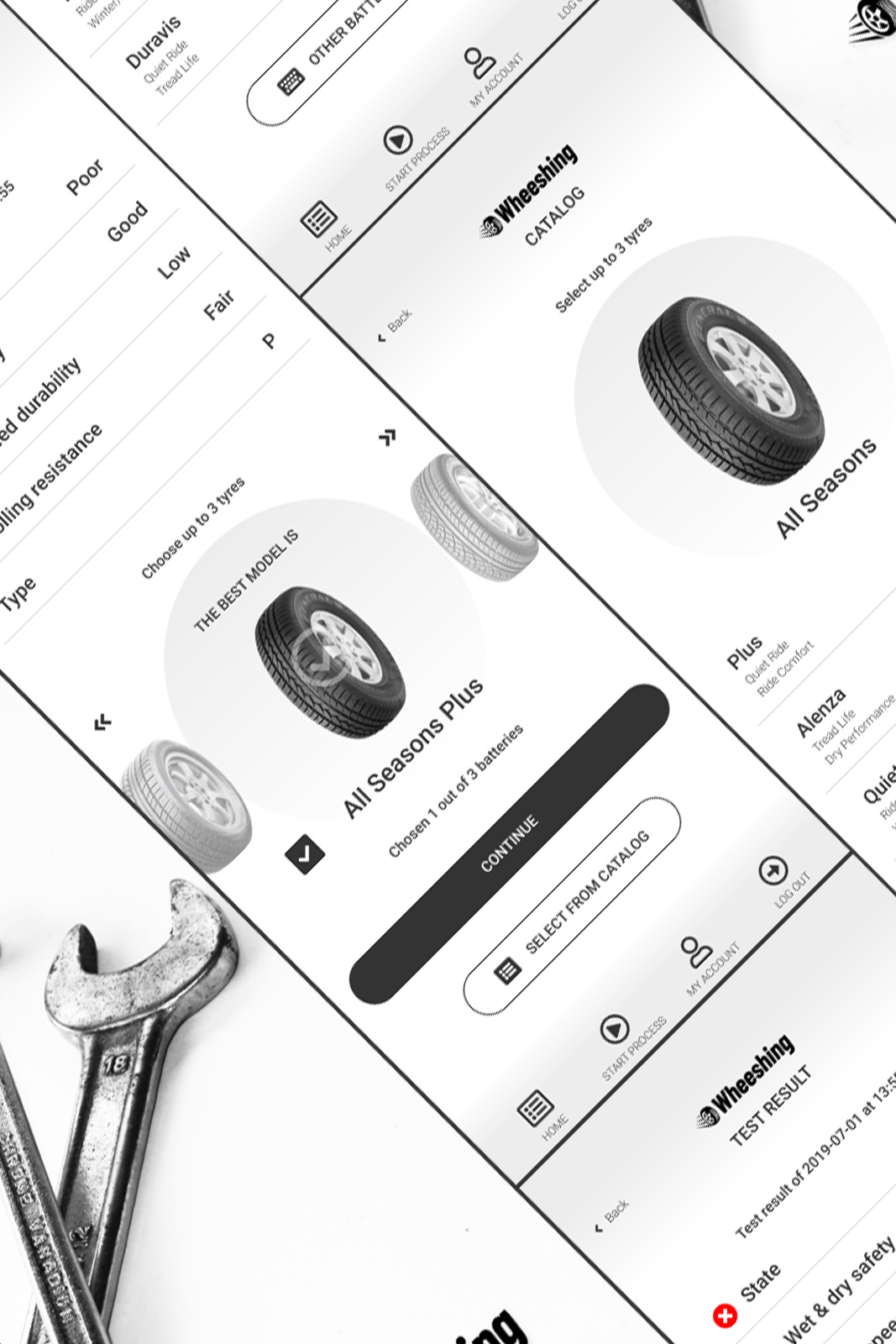
If the tires are in poor condition, users can select up to three replacement options and generate a quote.
Users send the quote to the car owner via message and receive real-time replies in the dashboard.

Explore my article detailing the Wheeshing App's user experience, covering tasks like registration, dashboard navigation, initiating new client processes, managing unavailable tire scenarios, handling client quotation refusals, updating user information, and logging out. Dive into the full story here.
Read moreWheeshing successfully streamlined the tire replacement process, providing a seamless experience for both mechanics and car owners. The simplified workflows and intuitive design led to positive feedback, with users highlighting the ease of use and clear visual hierarchy.
Reflecting on this project, here are a few things I learned:
They helped us shape the app around real needs rather than assumptions.
It ensured consistency and smooth collaboration with developers.
Testing early and often helped us avoid costly redesigns later.
