BBG Global Design System
Since 2023, GDS powers Berlin Brands Group with a scalable, cohesive design for all webshopsView case study
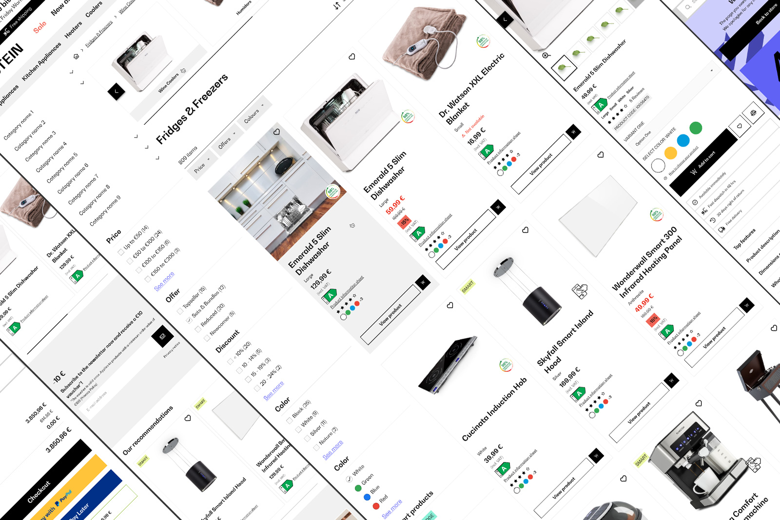
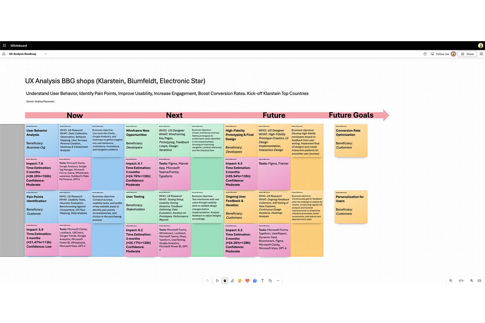
In 2024, BBG webshops—including Klarstein, Blumfeldt, and Electronic Star—struggled with user engagement and conversion rates. Users faced friction during navigation and checkout, leading to reduced satisfaction and decreased task success rates. Our objective was to systematically identify pain points, improve accessibility, reduce user drop-off, and boost both engagement and conversions.
Berlin Brands Group, Berlin (DE)
Clarity, Whiteboard, Figma
UX Designer
Simplifying the multi-step checkout into a more linear, one-page process will increase the overall conversion rate by at least 30%.
Improving search-bar visibility on mobile devices will increase product discovery and reduce frustration.
Addressing accessibility issues (contrast, missing alt text, form labels) will expand our user base, enhance SEO, and boost overall satisfaction.
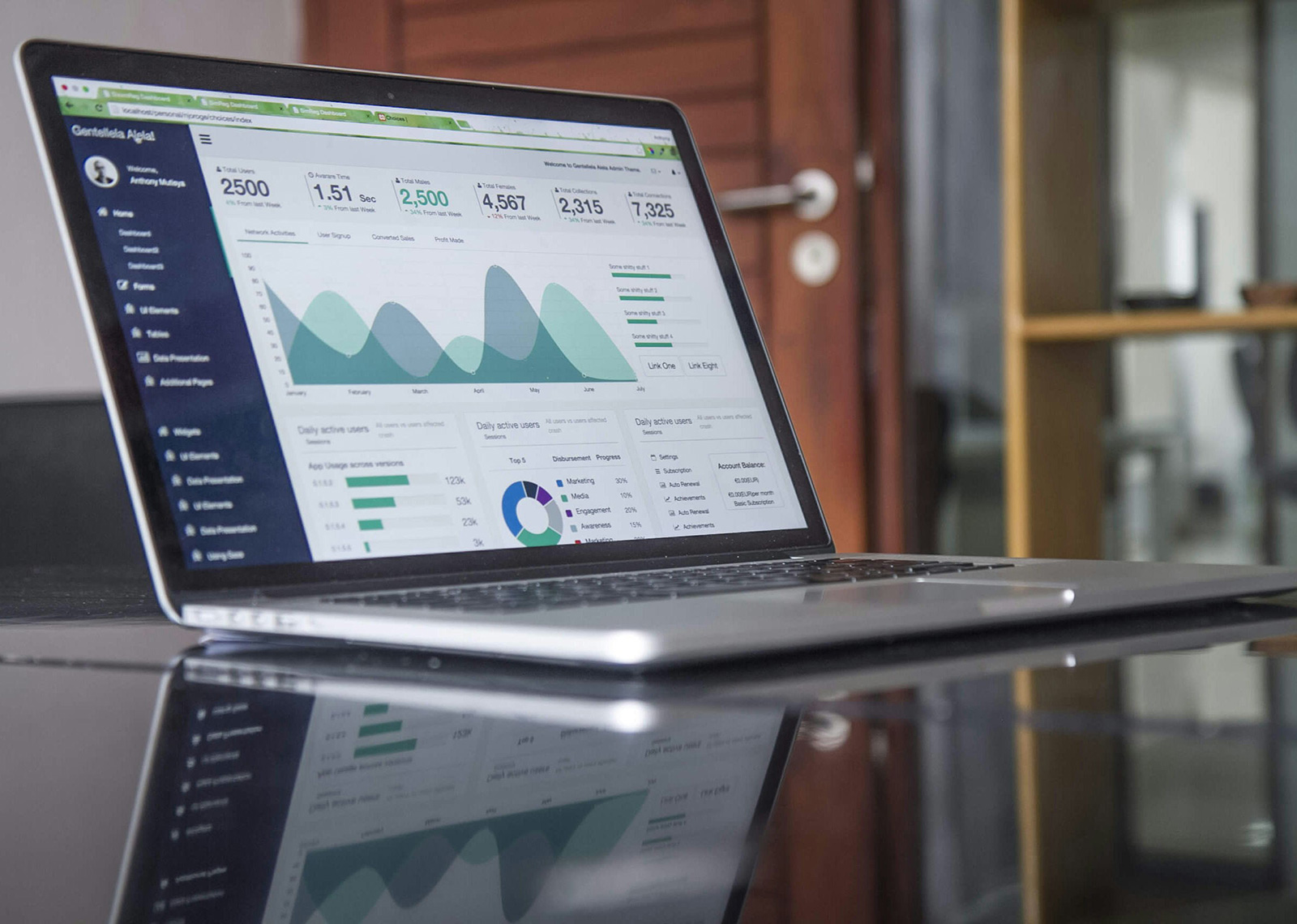
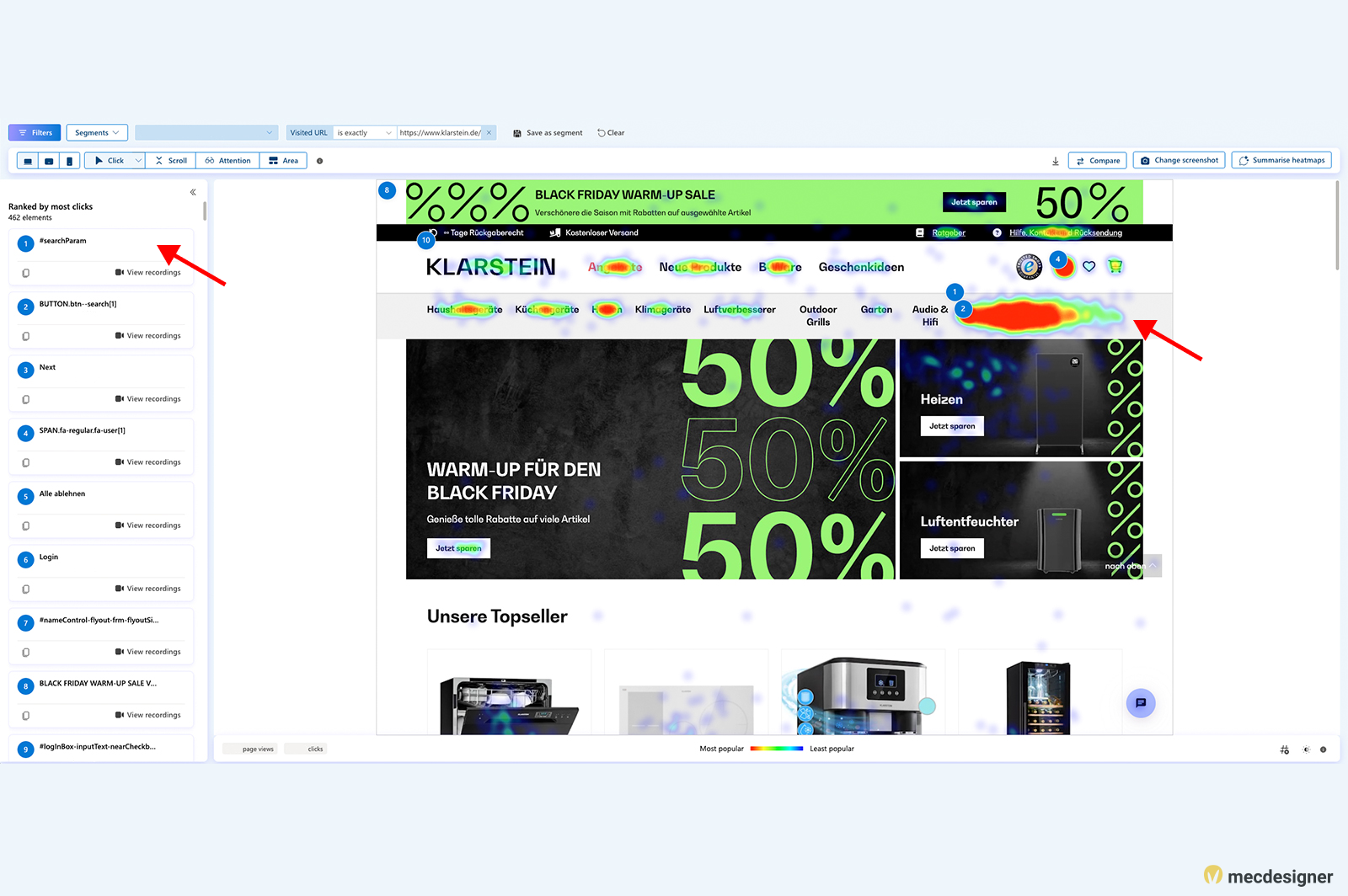
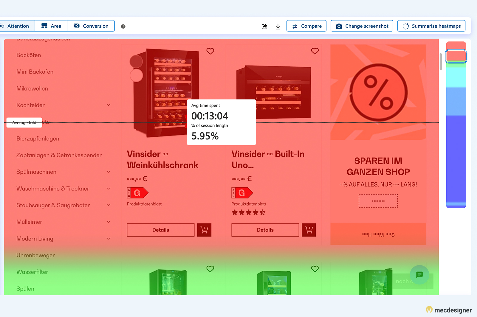
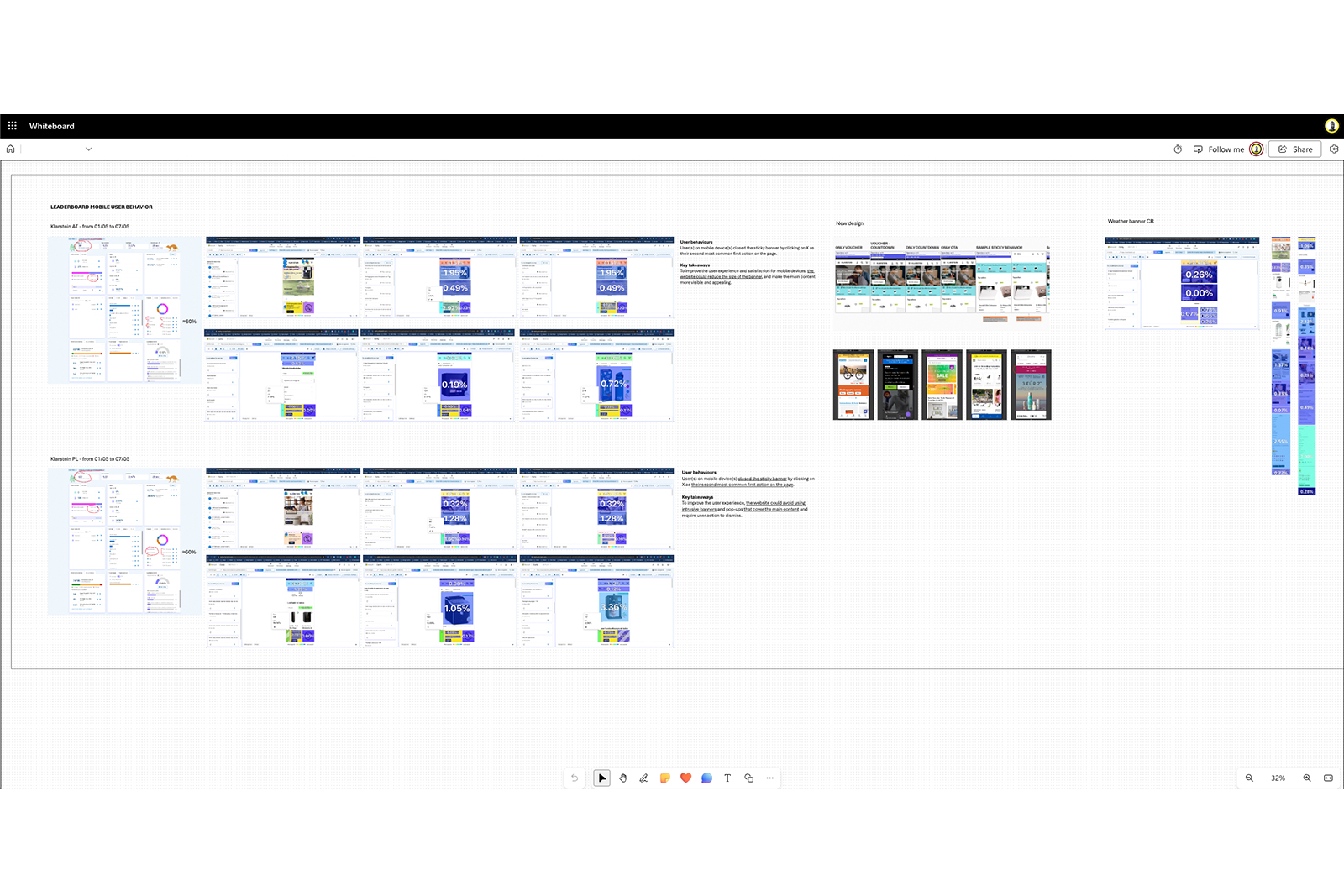
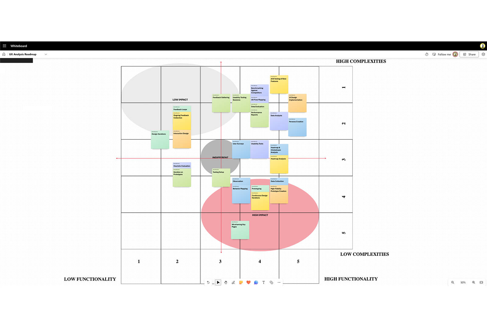
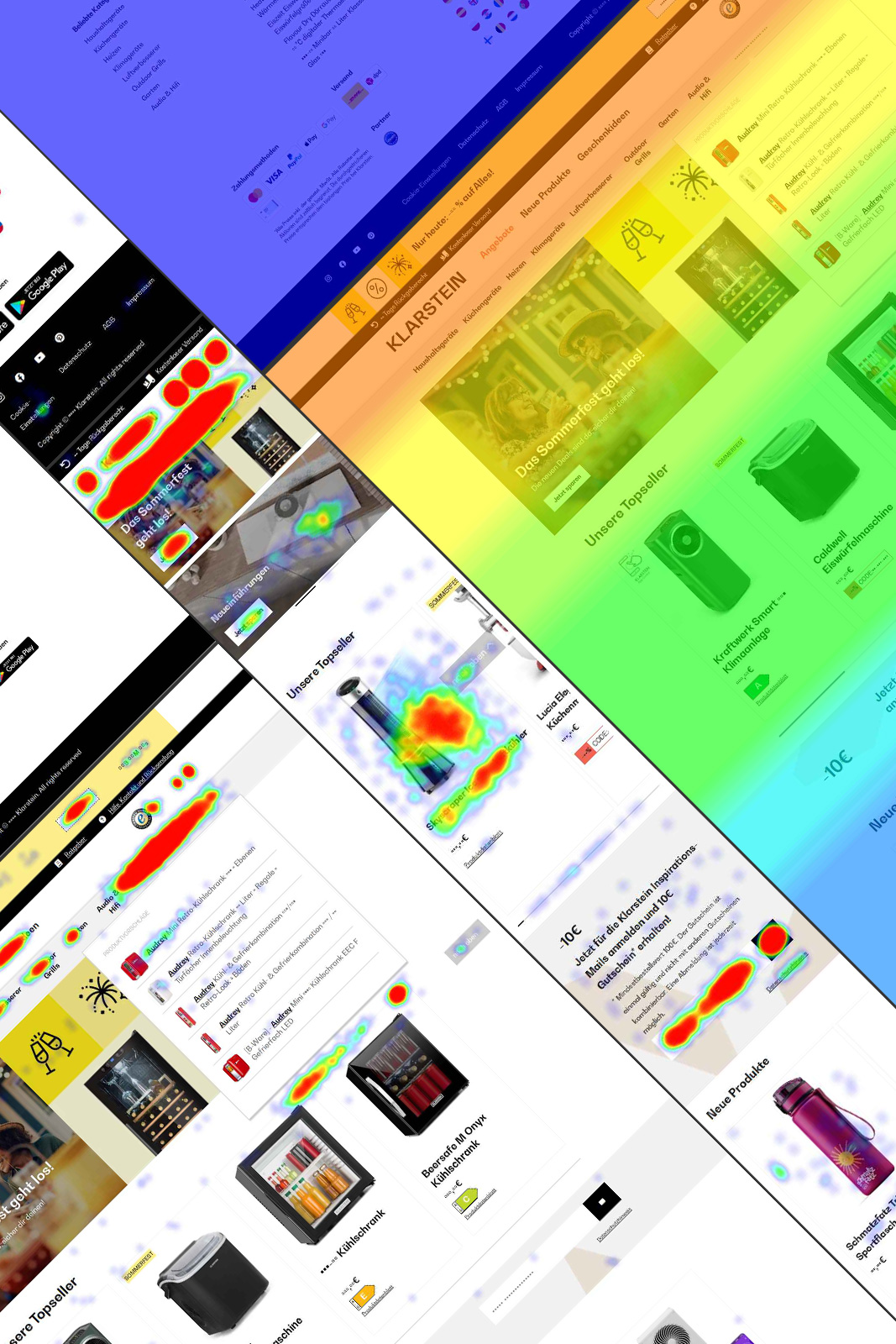
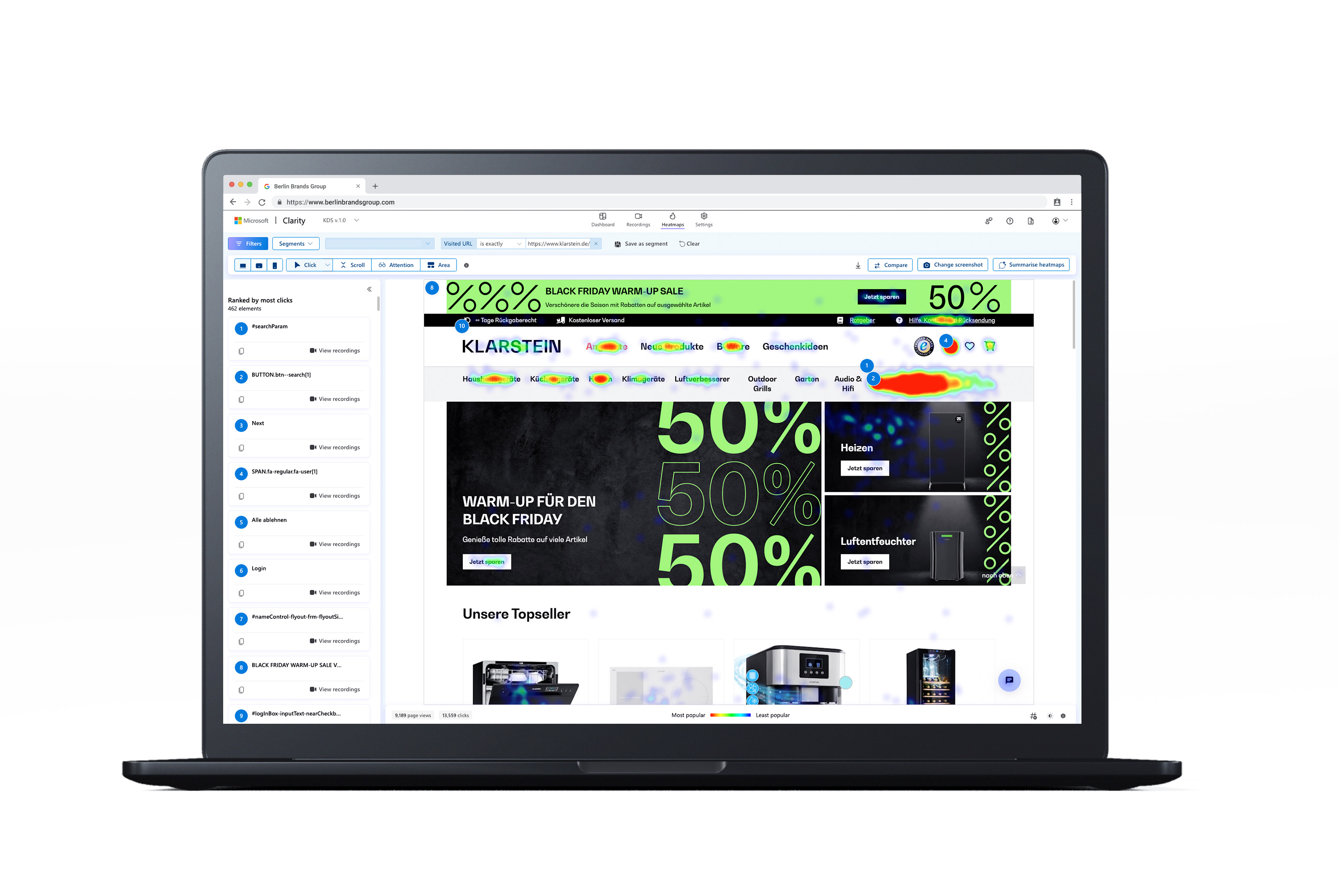
Visual representations in Microsoft Clarity revealed high- and low-engagement zones.
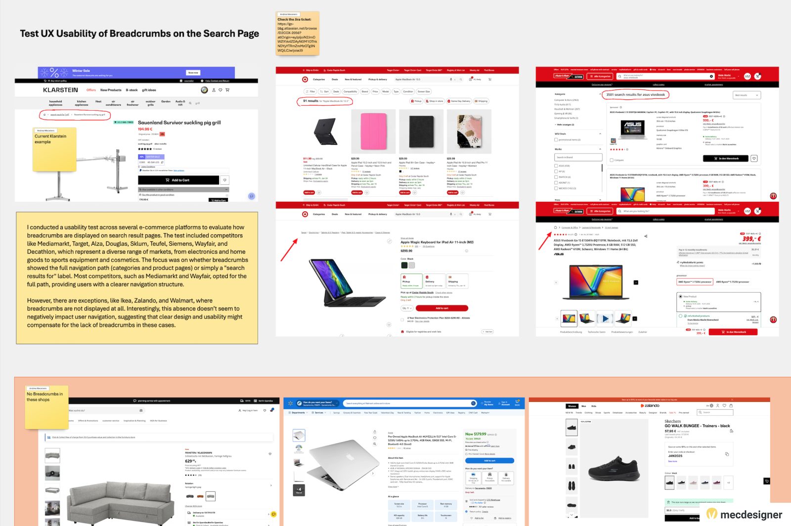
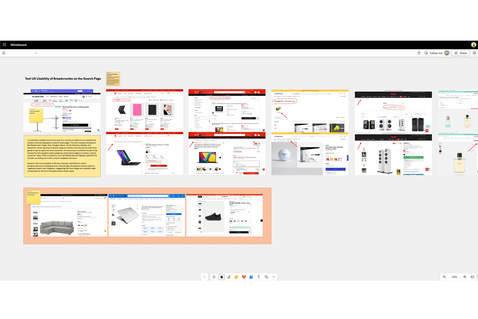
Compared our approach to leading e-commerce sites, spotting best practices in both usability and accessibility.
Tracked key metrics (sessions, CTR, scroll depth, engagement) via Clarity to pinpoint friction points.
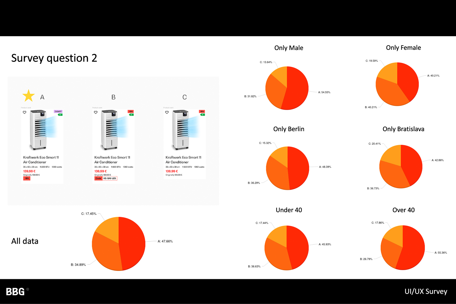
Compared design element variations (banners, product layouts) to measure engagement and conversion.

In addition to public user testing, we distributed short surveys to internal staff who regularly managed or interacted with the webshops. These surveys helped:
During the project, we performed an in-depth accessibility audit for each webshop. The audit revealed:
Certain text elements were too close in color to their backgrounds, violating WCAG 2.1 contrast ratios.
Missing or empty alt attributes for images, empty buttons and links without descriptive labels, broken ARIA references.
Redundant alt text, multiple images near each other with the same alternative text, inconsistent or missing fieldset tags for grouped radio buttons or checkboxes, overlapping links leading to the same destination.
Emphasis on using semantic HTML first (e.g., <button> vs. div+role="button"), ensuring correct ARIA roles (role="dialog", aria-expanded, aria-live, etc.) only when needed, proper focus management for modals and dynamic content.
An in-depth analysis uncovered several critical issues affecting user satisfaction and task efficiency:
Multi-step process contributed significantly to user drop-offs.
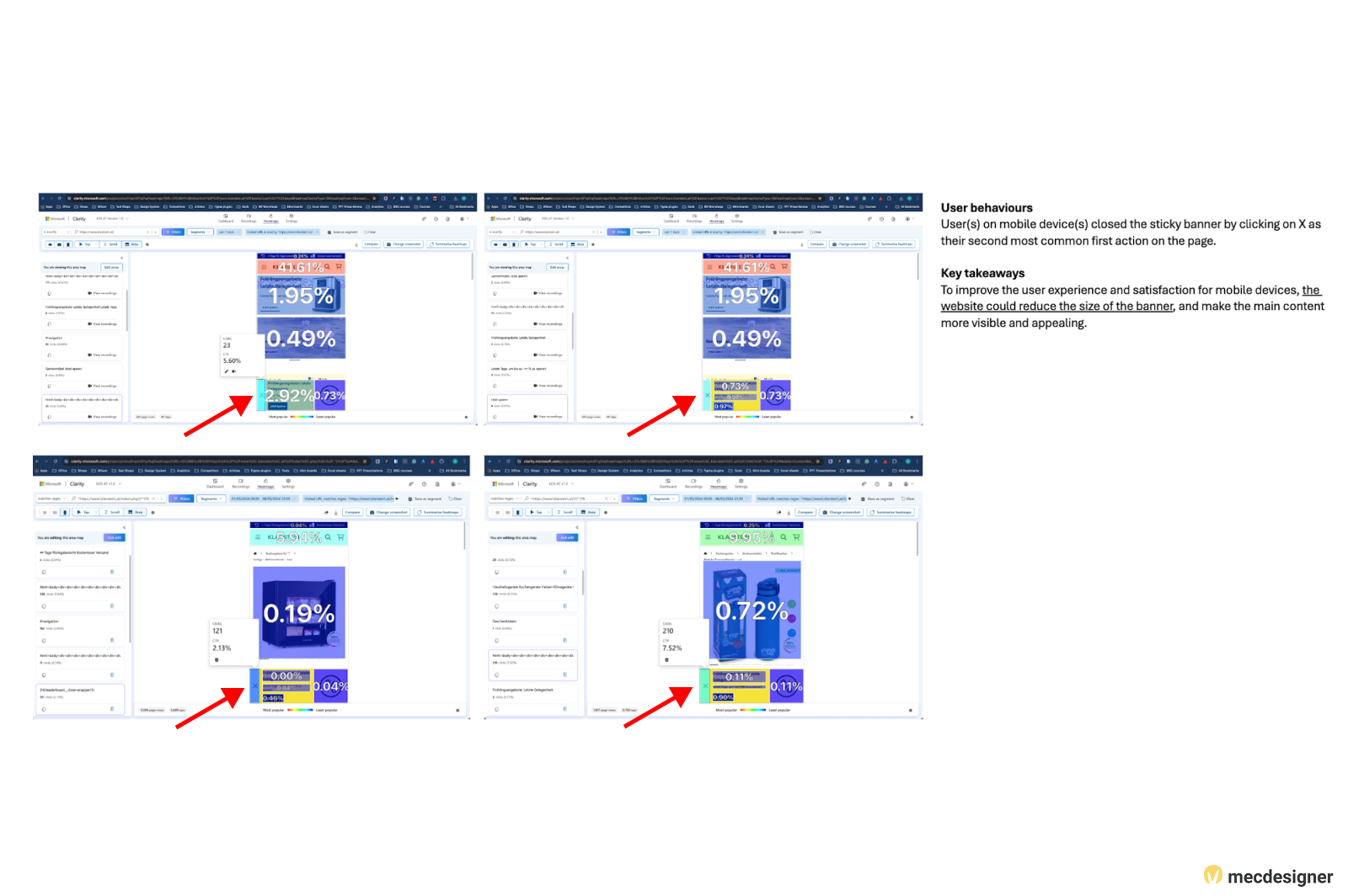
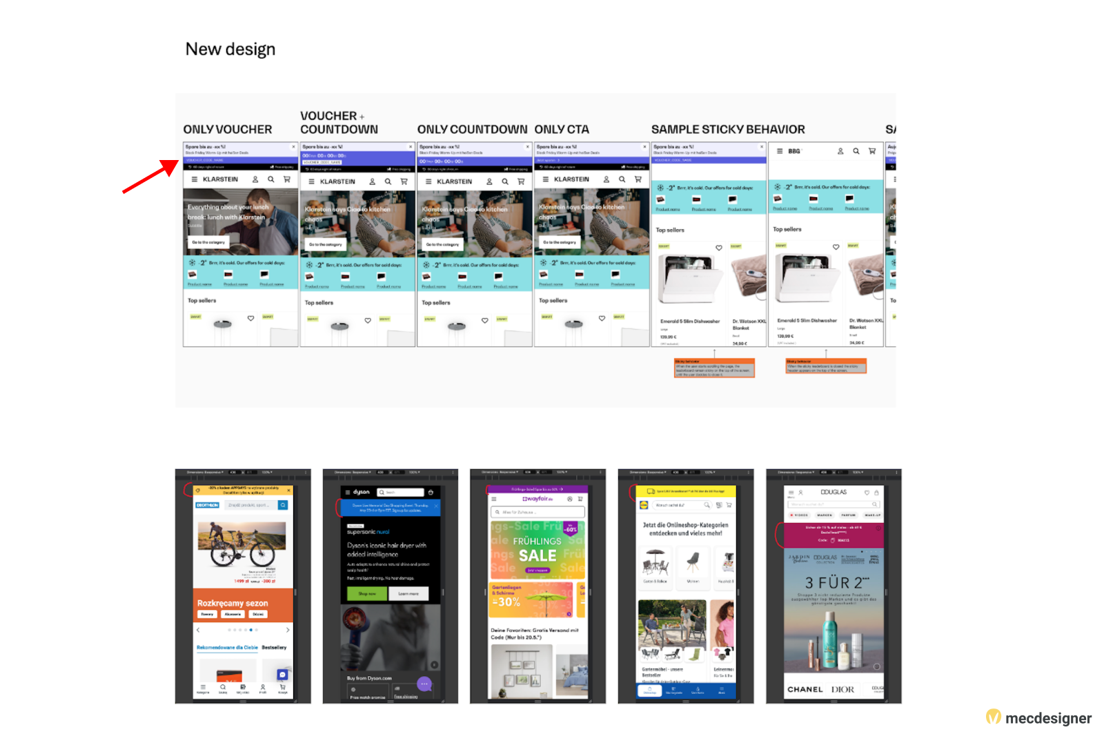
Large mobile banners limited visibility of core site content.
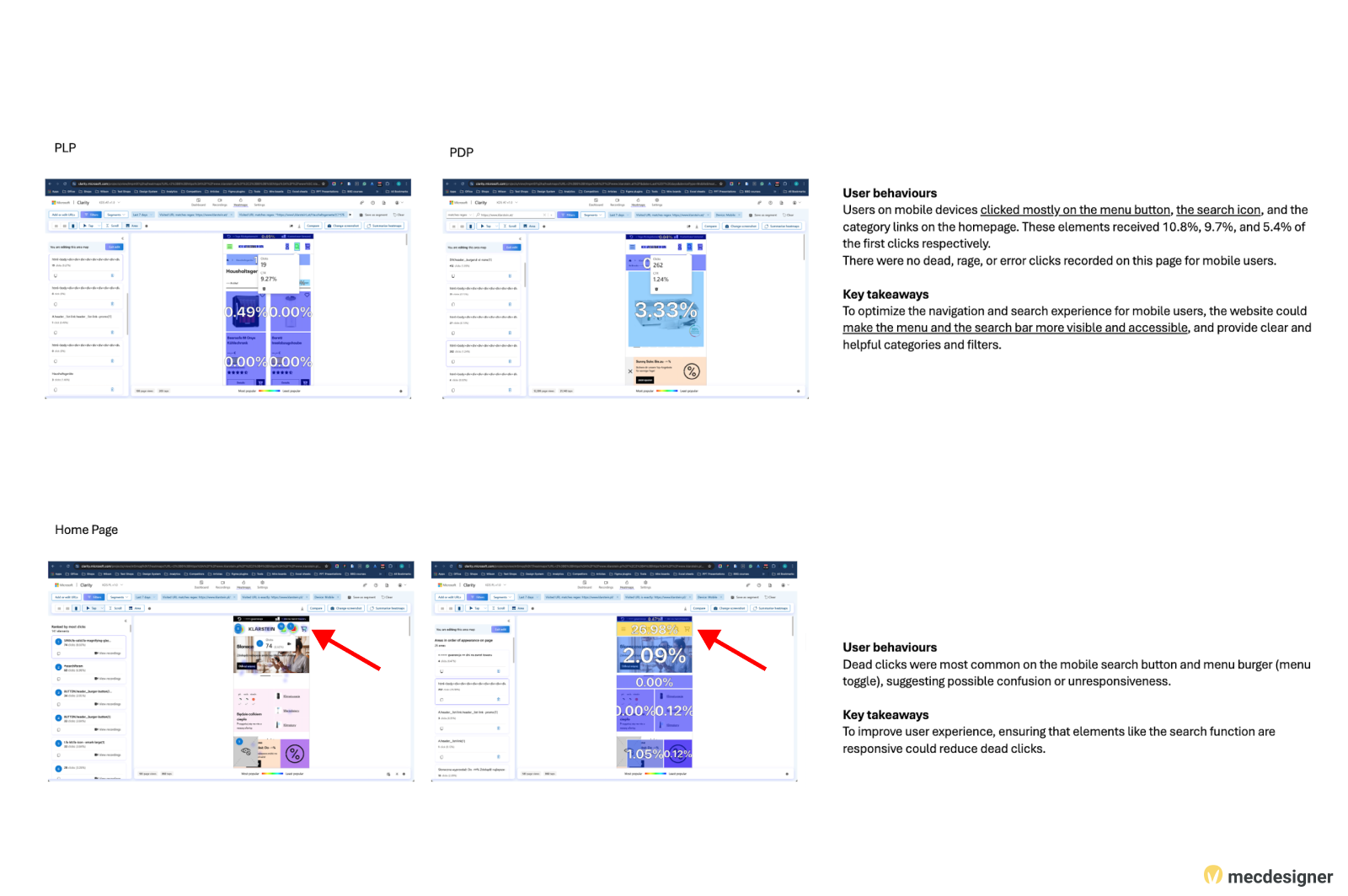
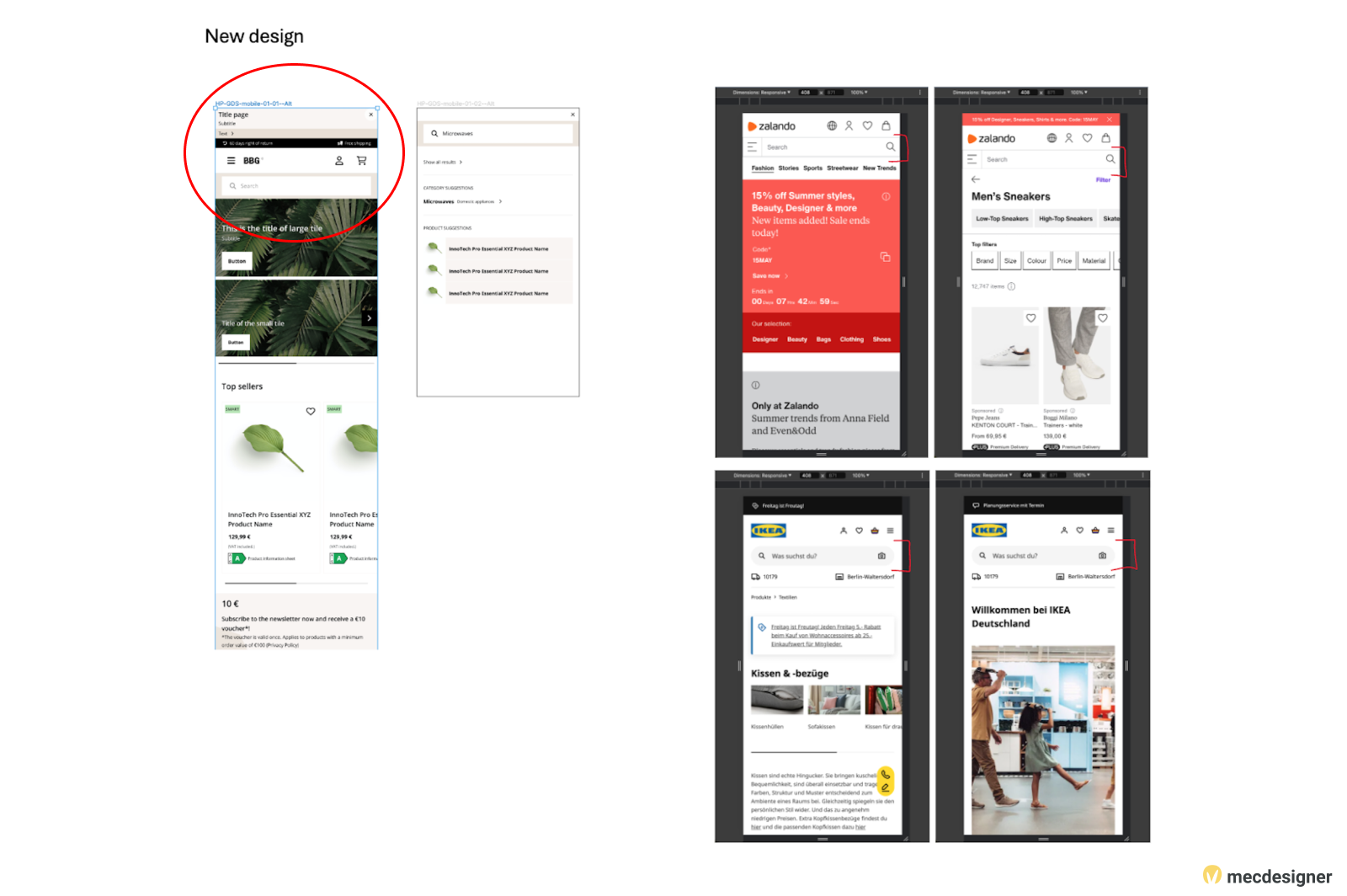
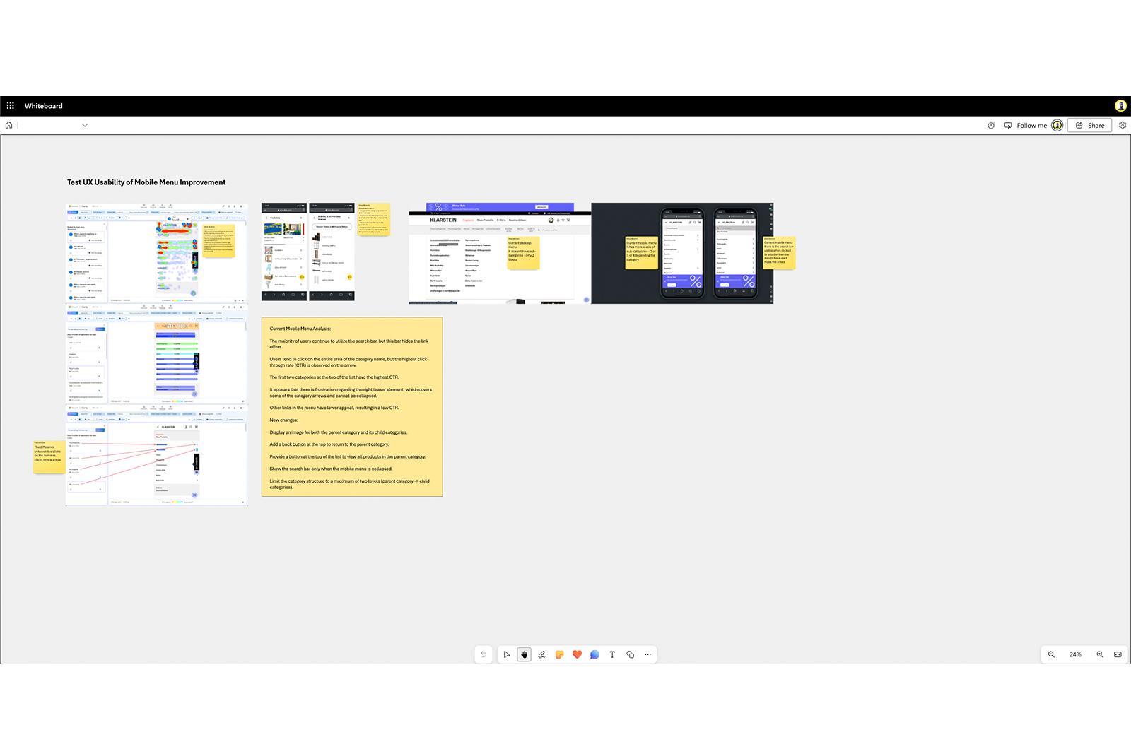
Mobile search lacked prominence, hurting product discoverability.
Minimal space for targeted promotions or offers.
Low usability led to rage clicks and user frustration.
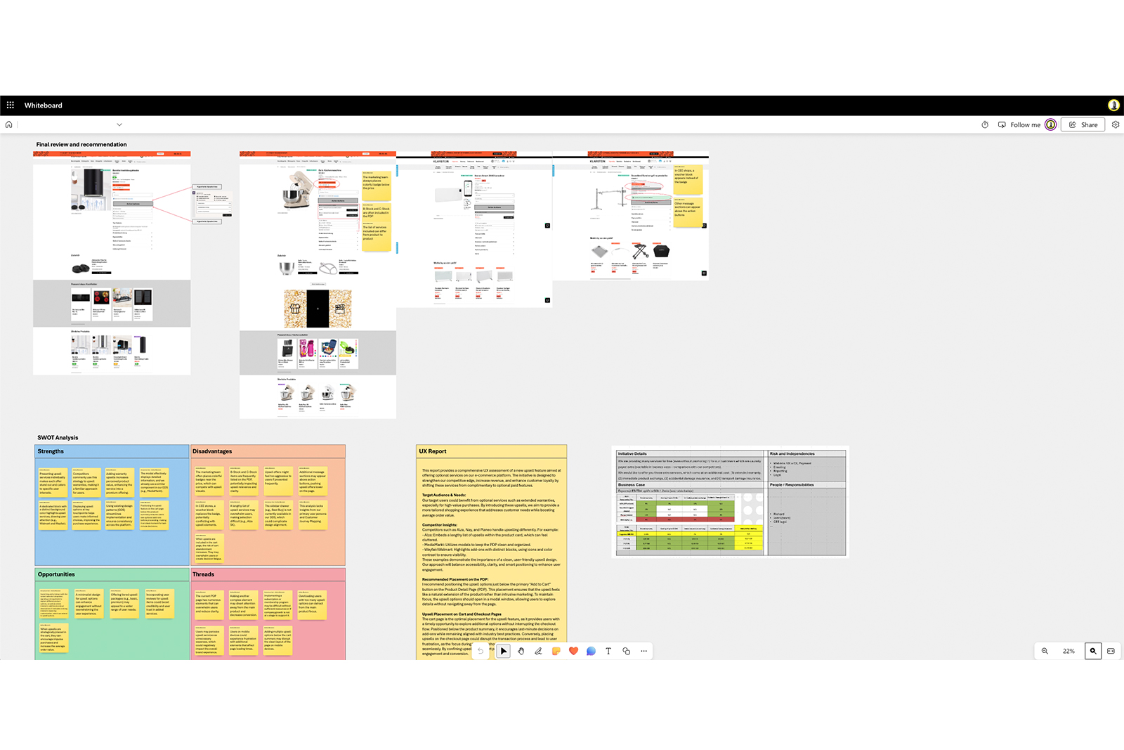
Poorly placed variation selectors (size, color) created confusion and slowed purchasing.
To address these challenges, we implemented targeted improvements:
Consolidated multiple steps into a single page, reducing friction and simplifying transactions.
Redesigned banners—especially on mobile—to convey essential info without dominating screen space.
Repositioned and visually emphasized the search bar, making product discovery more intuitive.
Introduced well-placed marketing blocks on listing pages, homepage, and basket pages.
Refined widget logic to reduce confusion and rage clicks, improving overall help experience.
Reorganized and clearly labeled size/color selectors, speeding up item selection.
Adjusted foreground/background contrast ratios to meet 4.5:1 (or 3:1 for large text) using tools like Accessible Colors.
Added meaningful alt text (or empty alt for decorative images), ensured all form elements had proper <label> or ARIA labeling.
Combined or removed adjacent links pointing to the same page, provided descriptive link text for clarity (avoid “click here”).
Grouped related checkboxes/radio buttons under <fieldset> + <legend> to aid screen readers.
Data collection, competitor analysis, and initial quick fixes.
A/B testing, usability & accessibility evaluations
Iterative design updates, flow optimization, and final rollout.
These UX enhancements addressed usability issues, boosted engagement, and improved conversion rates across BBG’s webshops. Key outcomes included:
| Metric | Before Improvements | After Improvements | Change |
|---|---|---|---|
| Returning Users | N/A (Baseline) | 5% higher | +5% |
| JavaScript Errors | Baseline Error Rate | Reduced by 20–40% | -20–40% |
| Performance Score | Baseline (e.g. 70) | +10 points (e.g. 80) | +10 points |
| Pages per Session | Baseline (e.g. 2 pages) | 3–5 pages | +1–3 pages |
| Time on Site | Baseline (e.g. 2 min) | +20–40 seconds | +20–40s |
| Dead Clicks | Baseline Click Rate | Reduced by 5% | -5% |
| Alt Text Coverage | ~70% of images had alt text | ~95% of images have meaningful alt text | +25% |
| Color Contrast Compliance | ~60% pass rate (WCAG) | ~95% pass rate | +35% |
| Broken ARIA References | 40 references | 4 references | -90% |
| Missing Fieldsets/Labels | Baseline of 50 fields | 5 fields | -90% |
Heatmaps, analytics, and accessibility audits uncovered real user frustrations—both in general usability and barrier-free usage.
A/B tests + usability sessions refined designs, ensuring continuous improvement.
Tangible metrics (engagement, performance, and inclusive design) boosted both brand reputation and potential revenue.
“Methodical testing, analytics, and user-focused changes propelled BBG’s webshops toward a more cohesive, engaging user experience, setting a foundation for future growth.”
Explore my UX analysis of BBG webshops, where I improved checkout flow, banner placements, search functionality, product selection, and accessibility. Dive into the full story here!
Read more